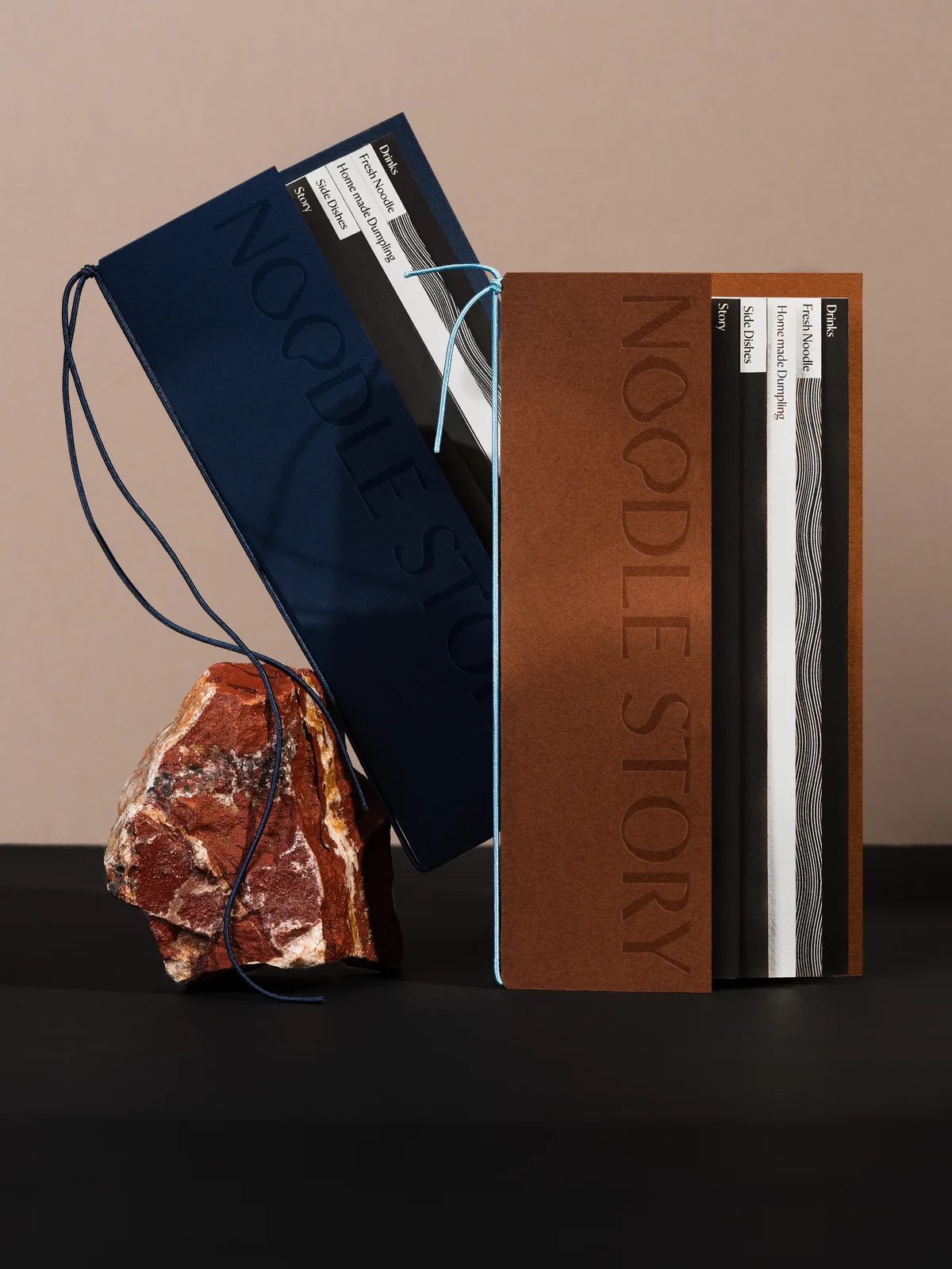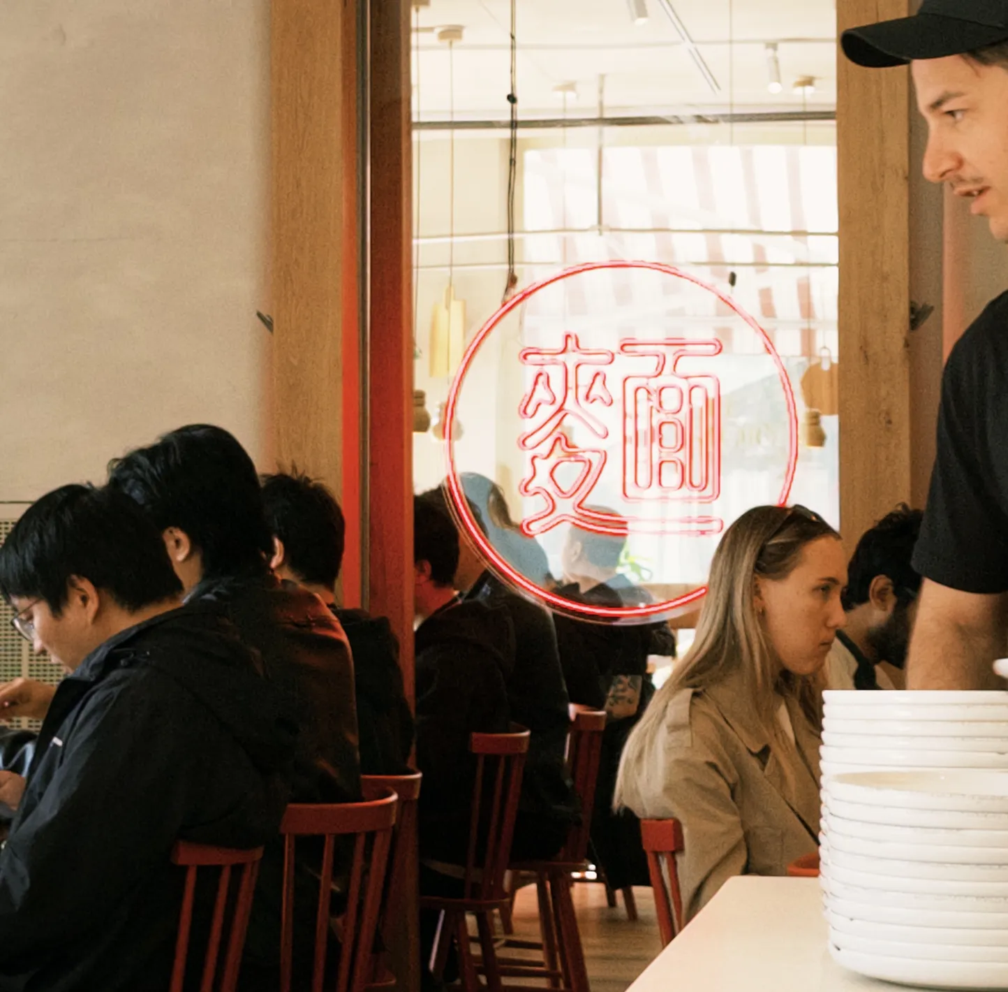
The restaurant needed an identity that celebrated the craft of handmade food while feeling at home in Helsinki’s contemporary design scene. The noodles themselves became the starting point: tactile, expressive and endlessly flexible.
I translated those physical qualities into a flexible system that could move across formats without losing its character.
Stretch × Fold × Gather
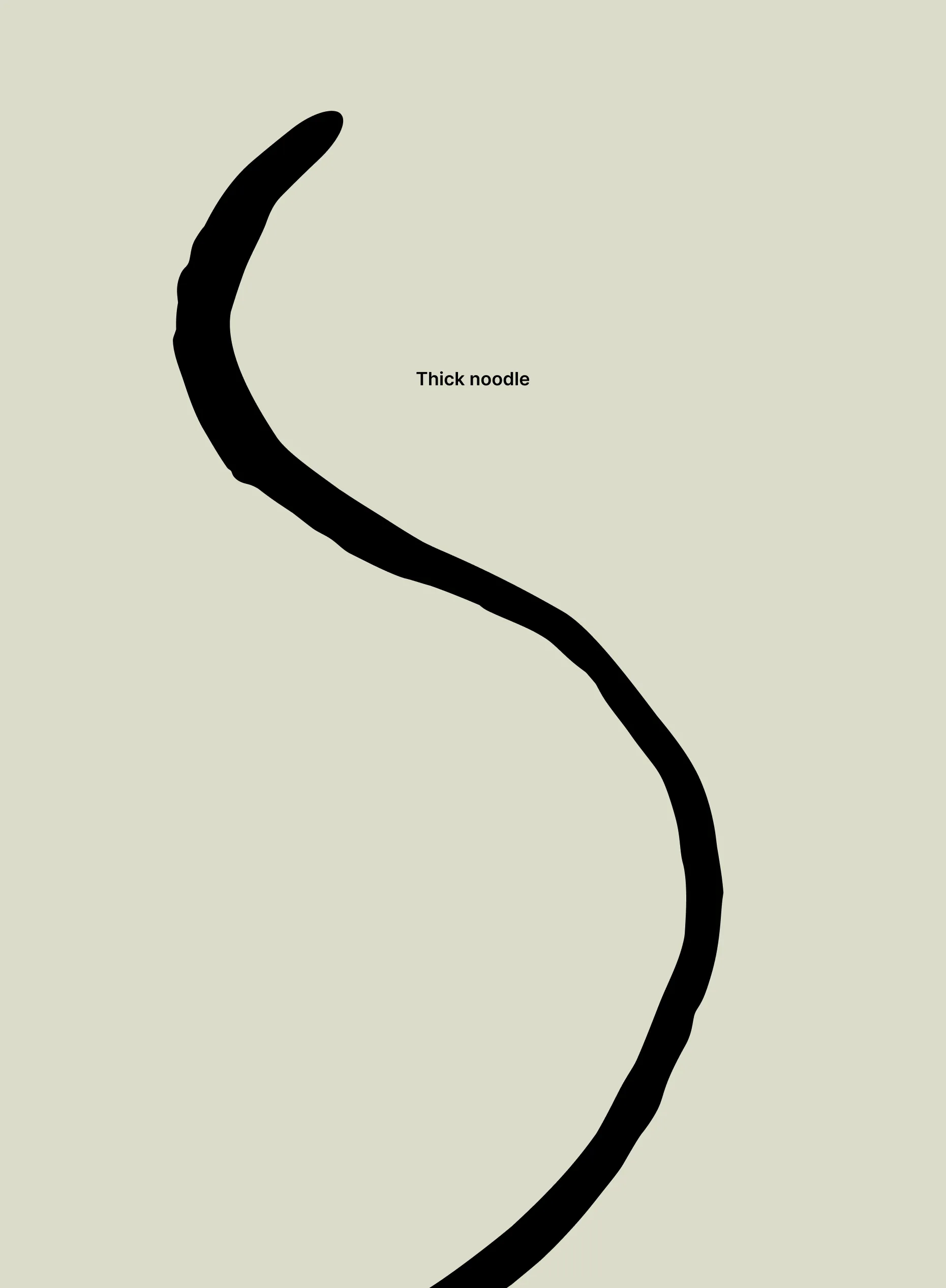
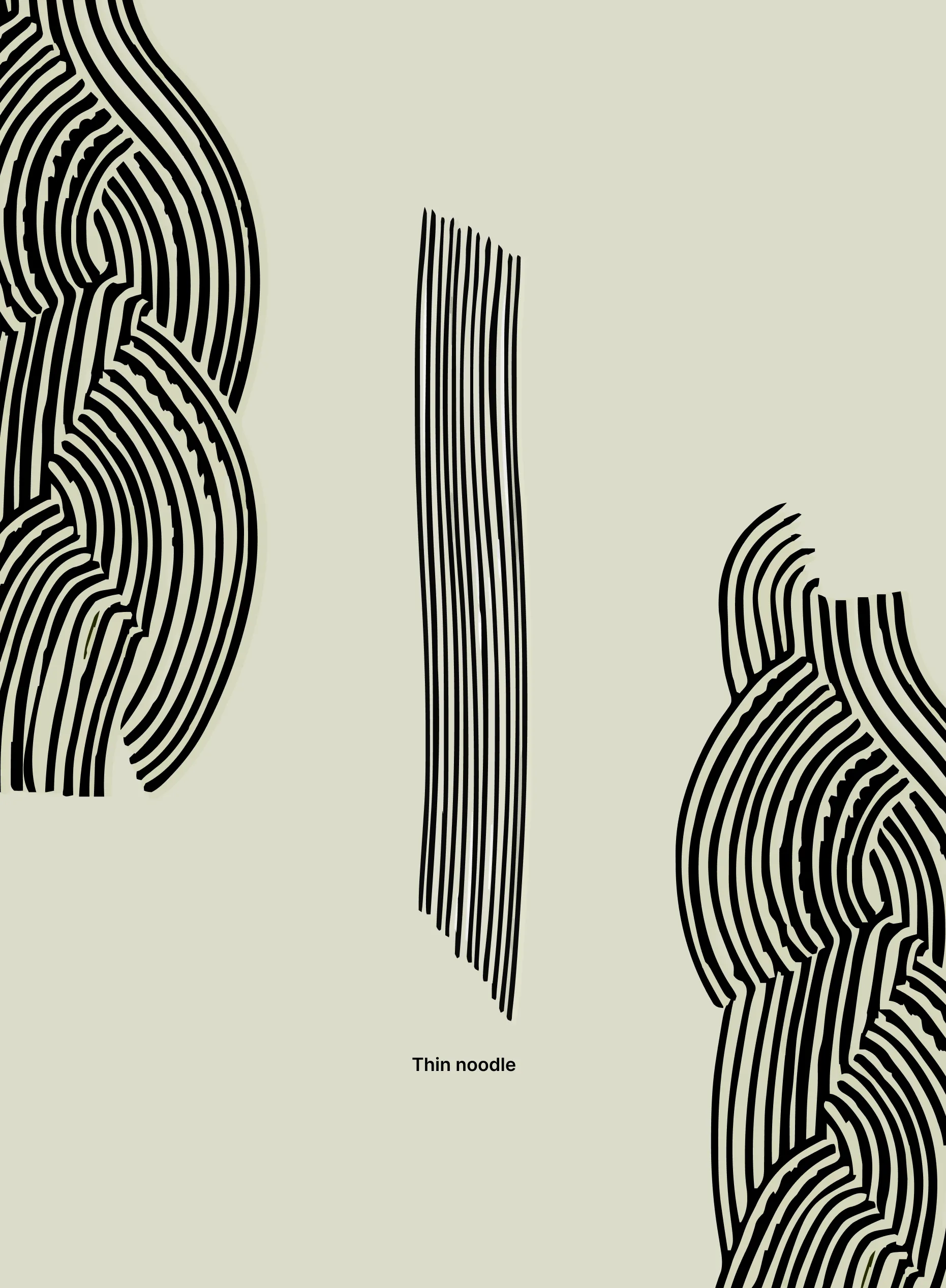
Thick × Thin
Playful × Practical
Physical × Digital


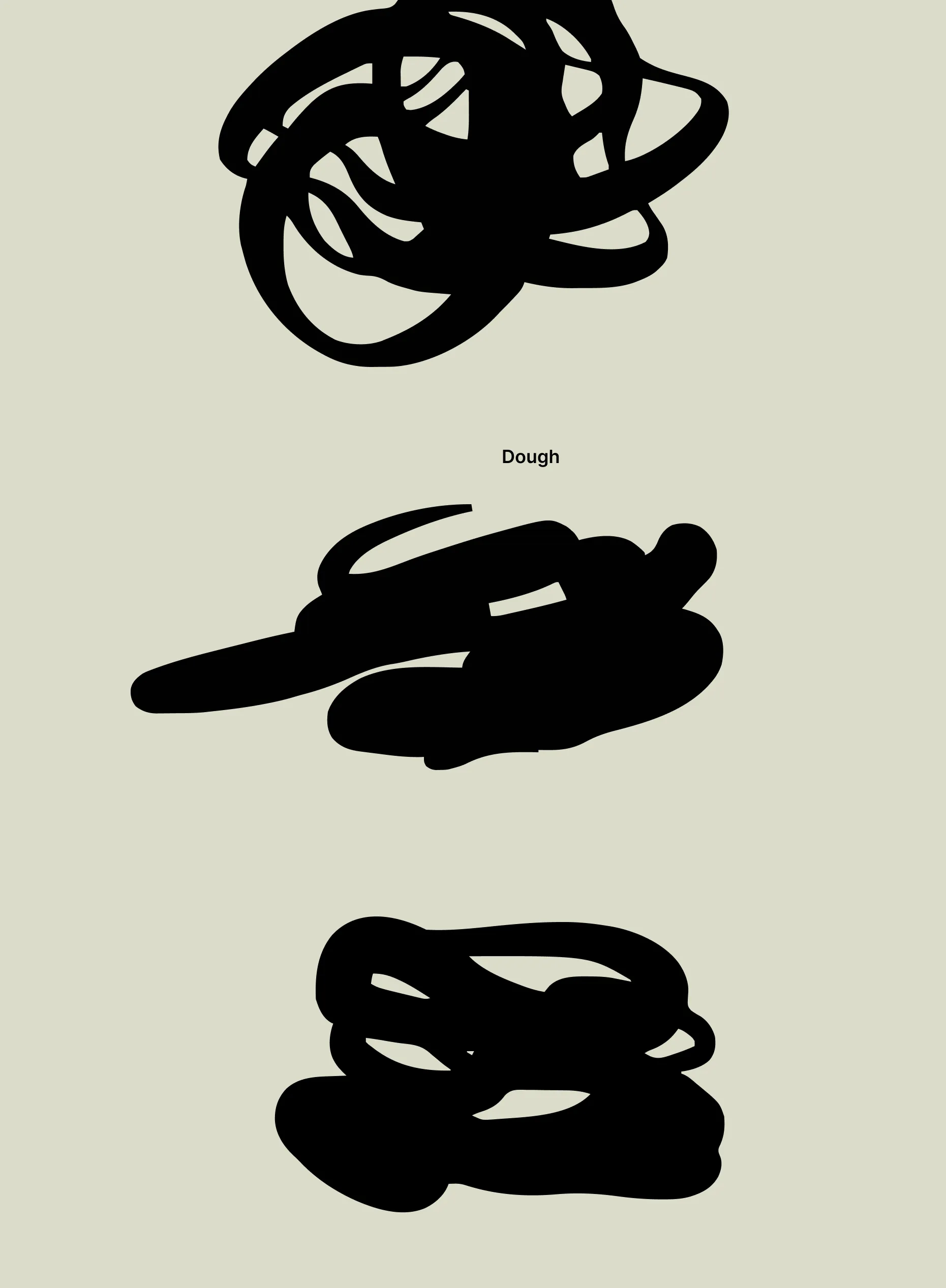
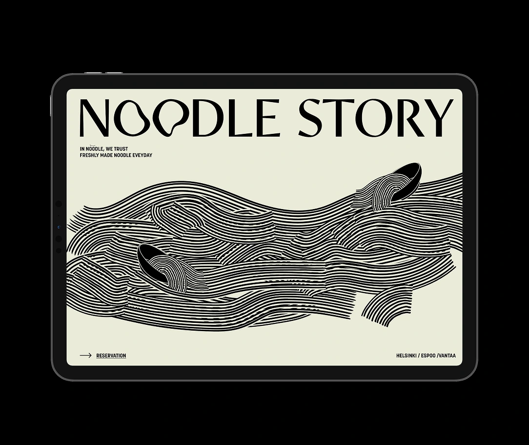
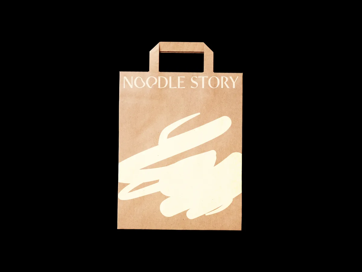
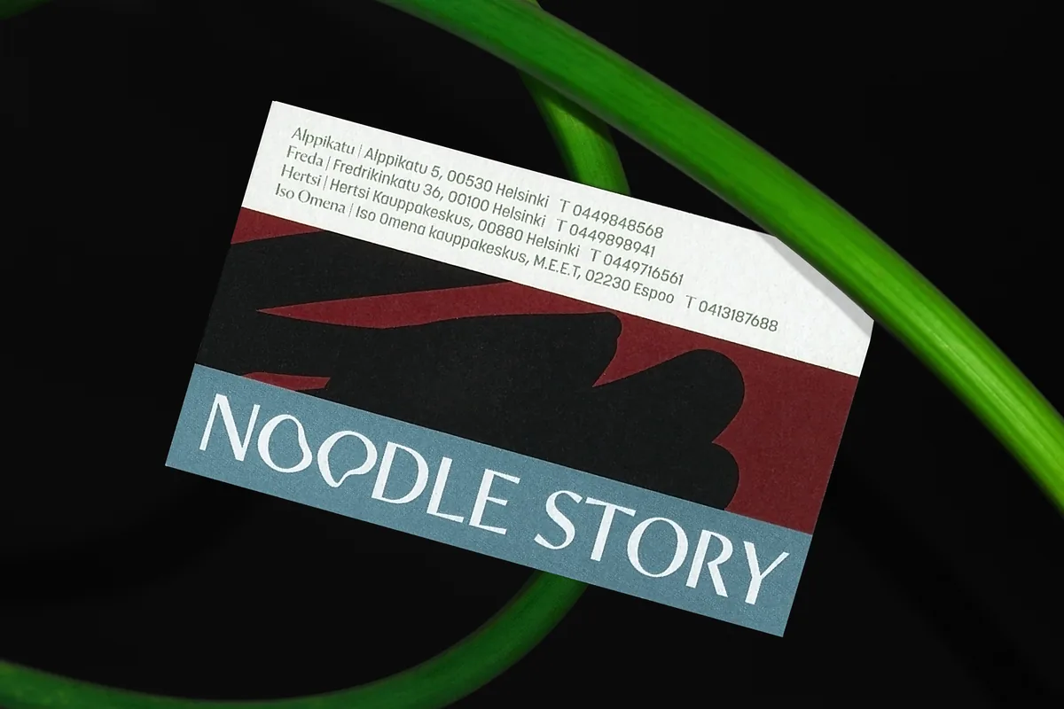
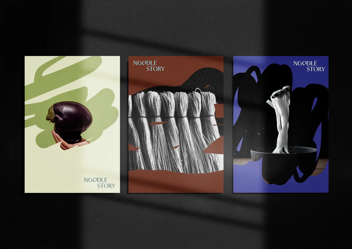
Broad brush shapes echo the weight of dough, while fine parallel lines reference strands of noodles. Together they create a graphic language that can stretch from menus and packaging to signage and digital.


Shapes stretch, crop and overlap differently across formats.
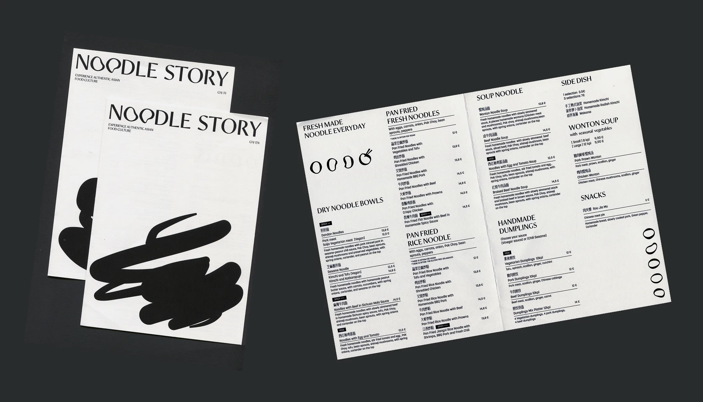
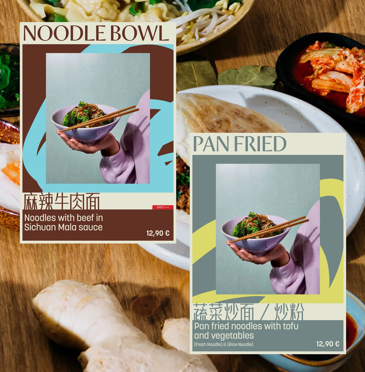
Display typography carries personality; menus and functional information stay easy to scan.
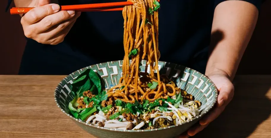
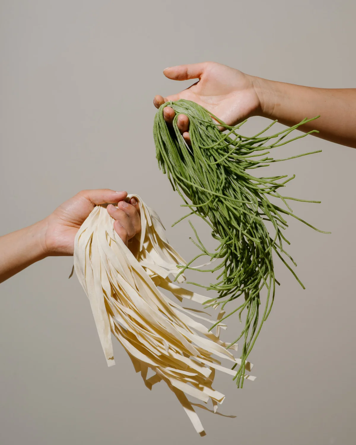
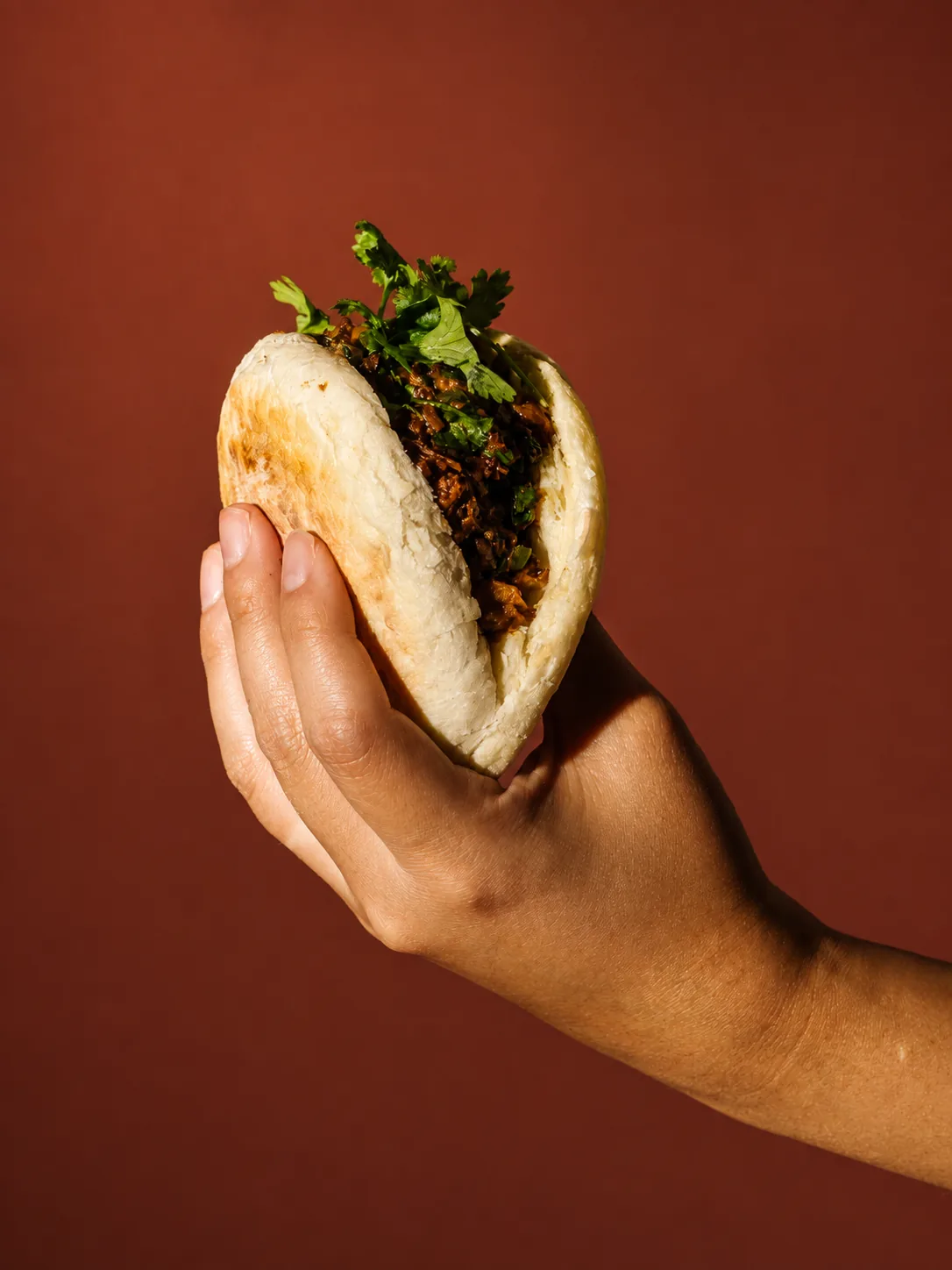
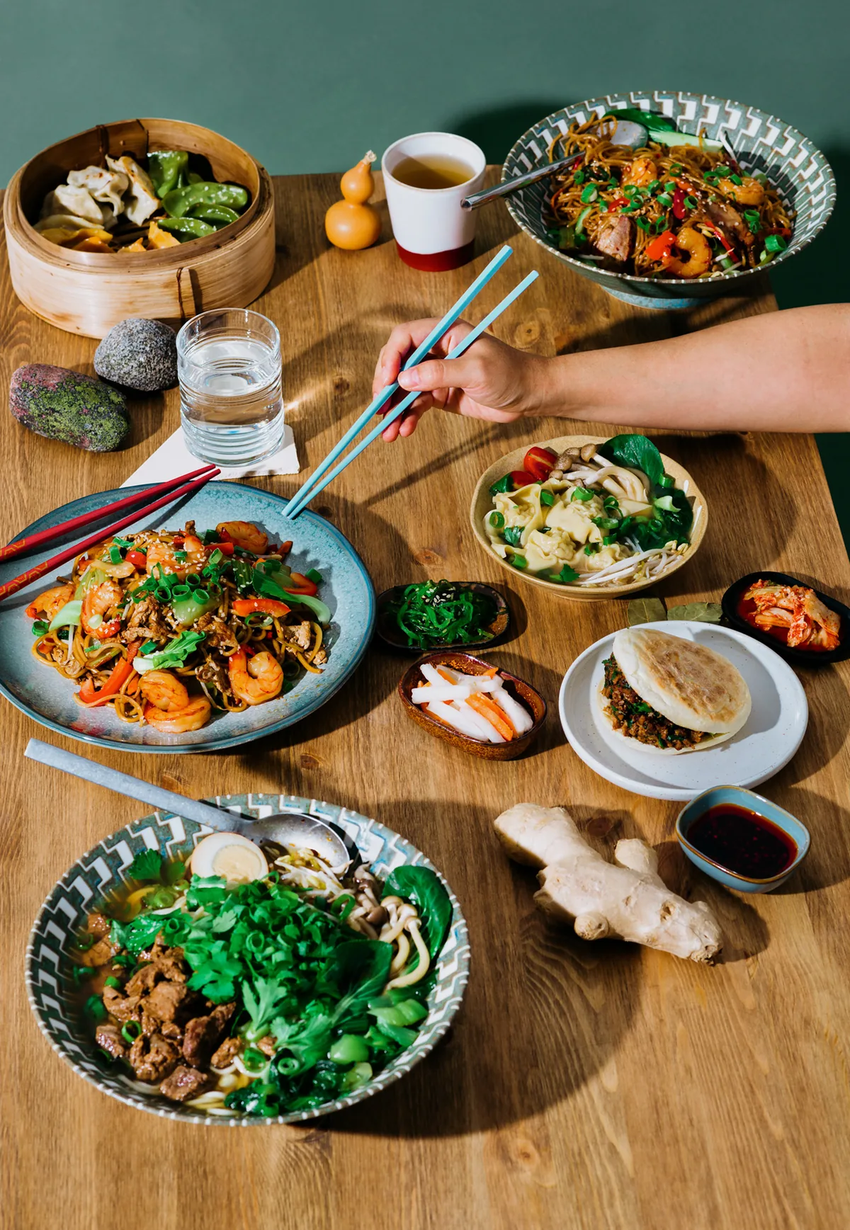
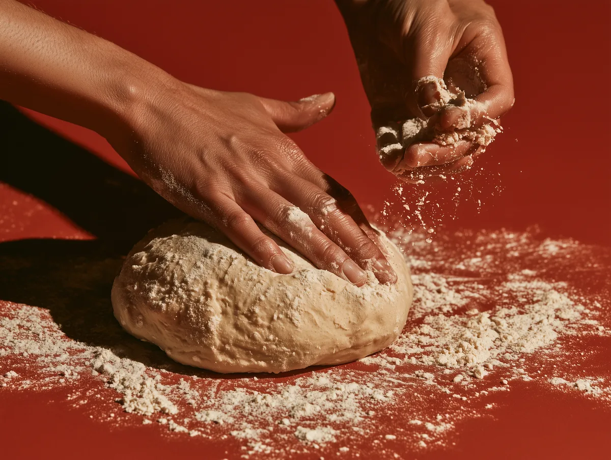
Hands, ingredients and close crops make the handmade quality part of the brand.

The restaurant needed to update menus, lunch offers and printed materials regularly.
I created editable templates so the team could keep the identity consistent by simply replacing text and imagery.


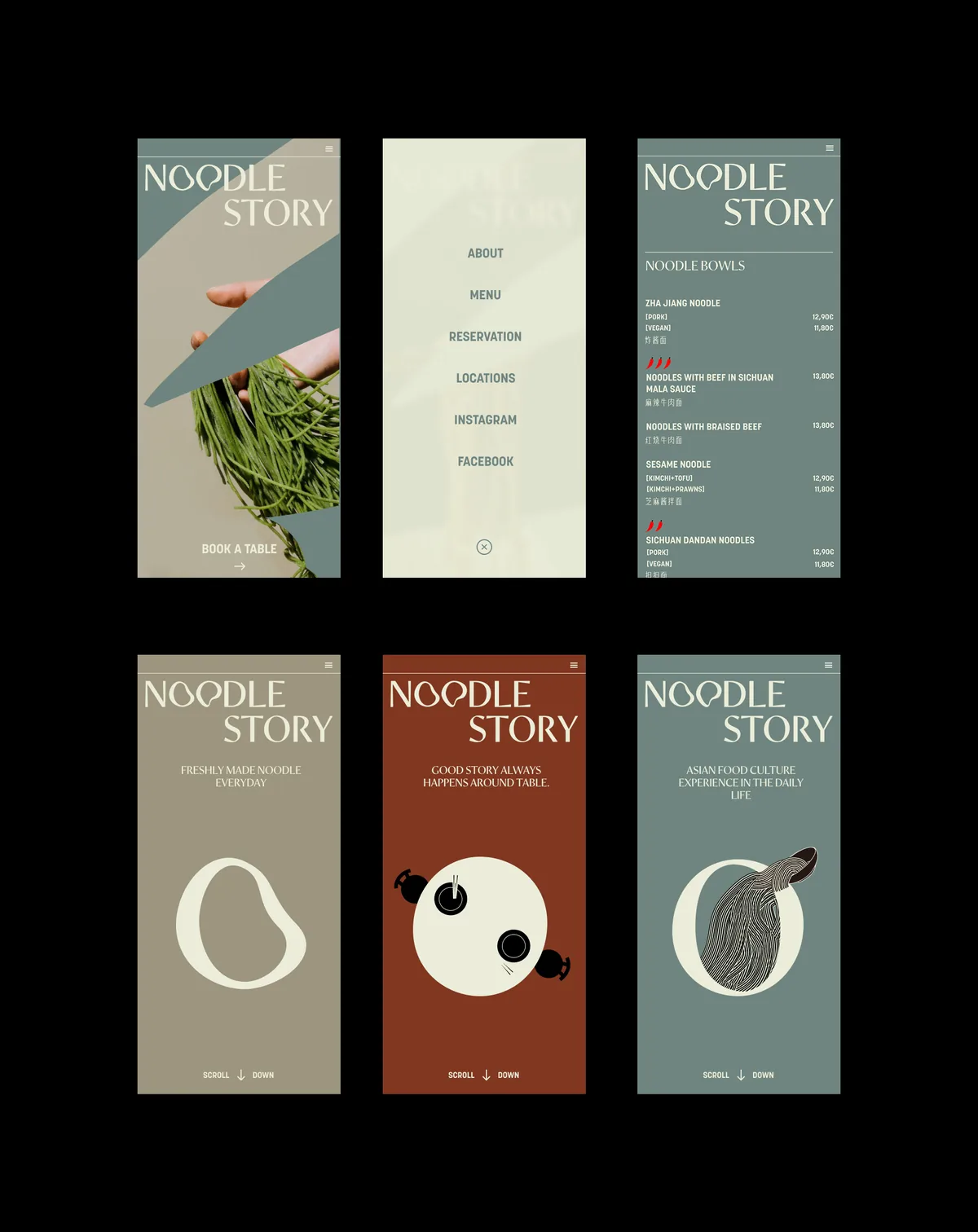
Oversized typography and editorial photography create an expressive first impression, while simple navigation keeps practical actions such as viewing the menu, finding locations and making a reservation immediately accessible.
Website development — Oscar Gómez

The photography brings the making process close: hands, ingredients and noodles are treated almost as sculptural subjects.
Working with photographer Aava Eronen, I used tight crops and direct compositions to give the brand the same tactile energy as the graphic system.