LAB
(
·
)
A place for unfinished ideas
(
·
)
Some experiments become products
(
·
)
Some never leave the notebook
(
·
)
All of them teach me something
Gallery of experiments
Drag to explore · pinch to zoom
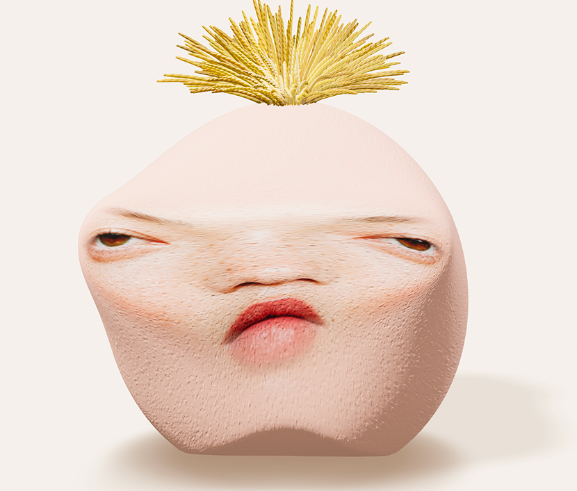
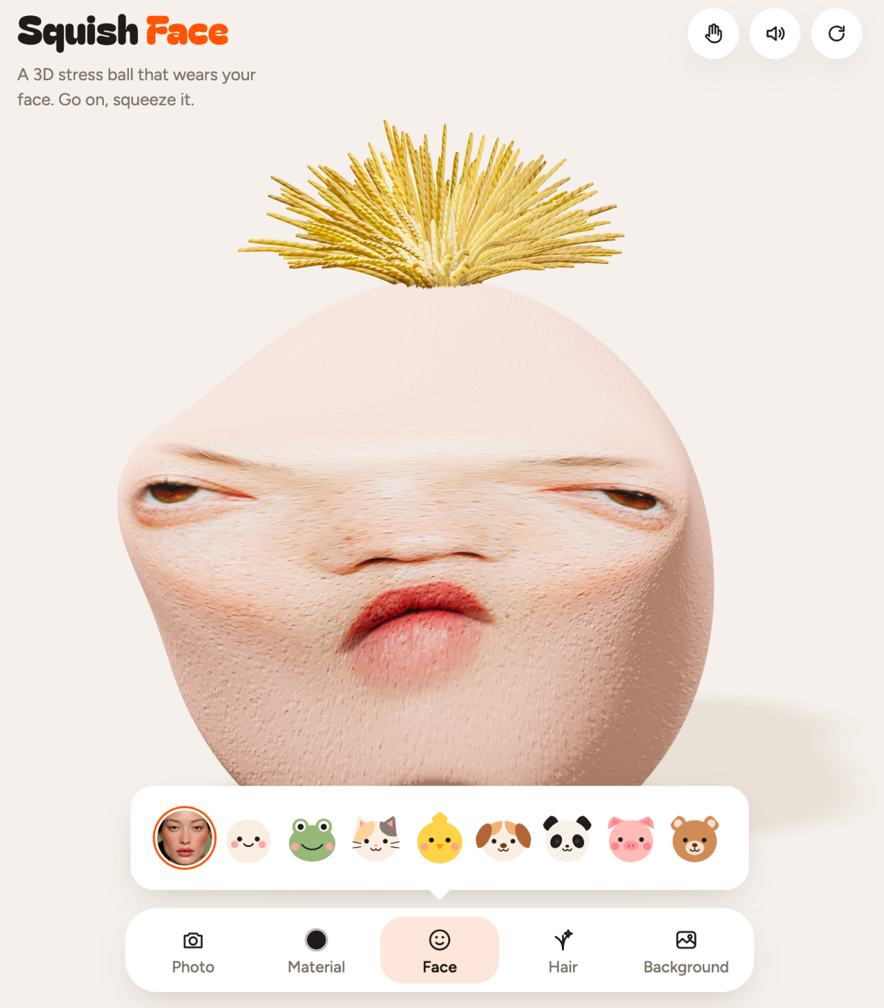
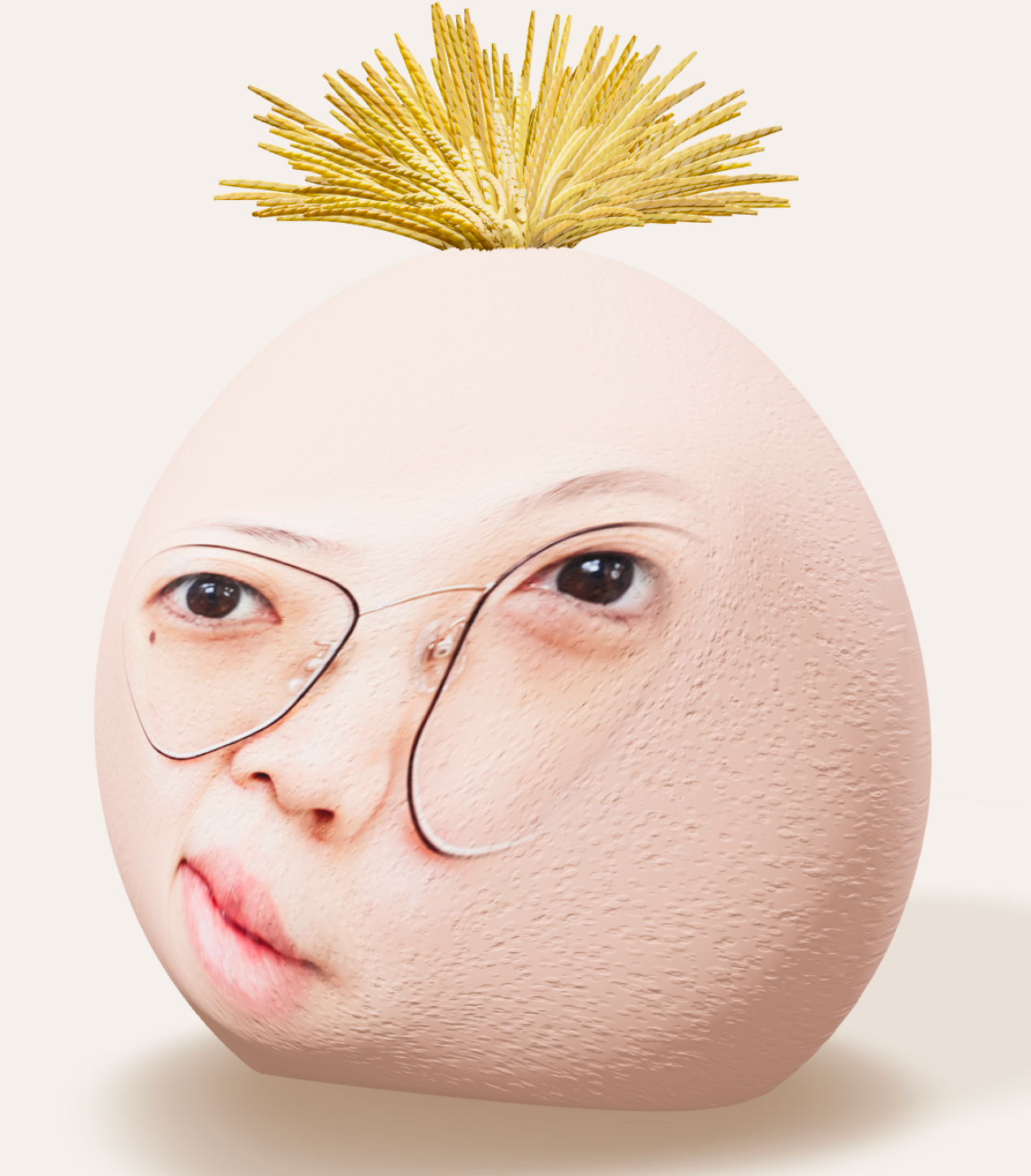
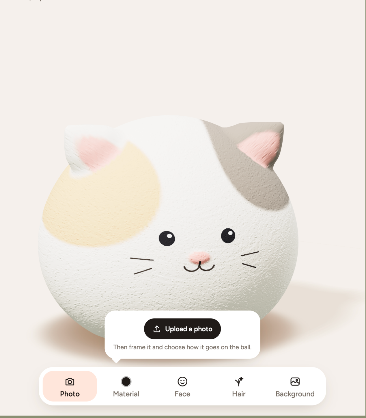
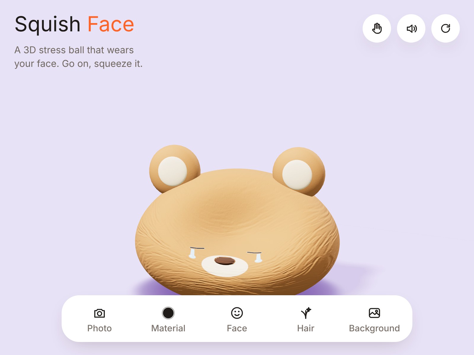
Squish Face
Squish Face
Squish Face turns any photo into a 3D stress ball you can squeeze, pinch, pick up and throw around the browser. Make it foamy, bouncy, plasticky or clay-like or skip the selfie and squish a frog, cat, chick or another weird little animal instead. A small AI experiment to see how far one silly idea can go.
Product

Growline
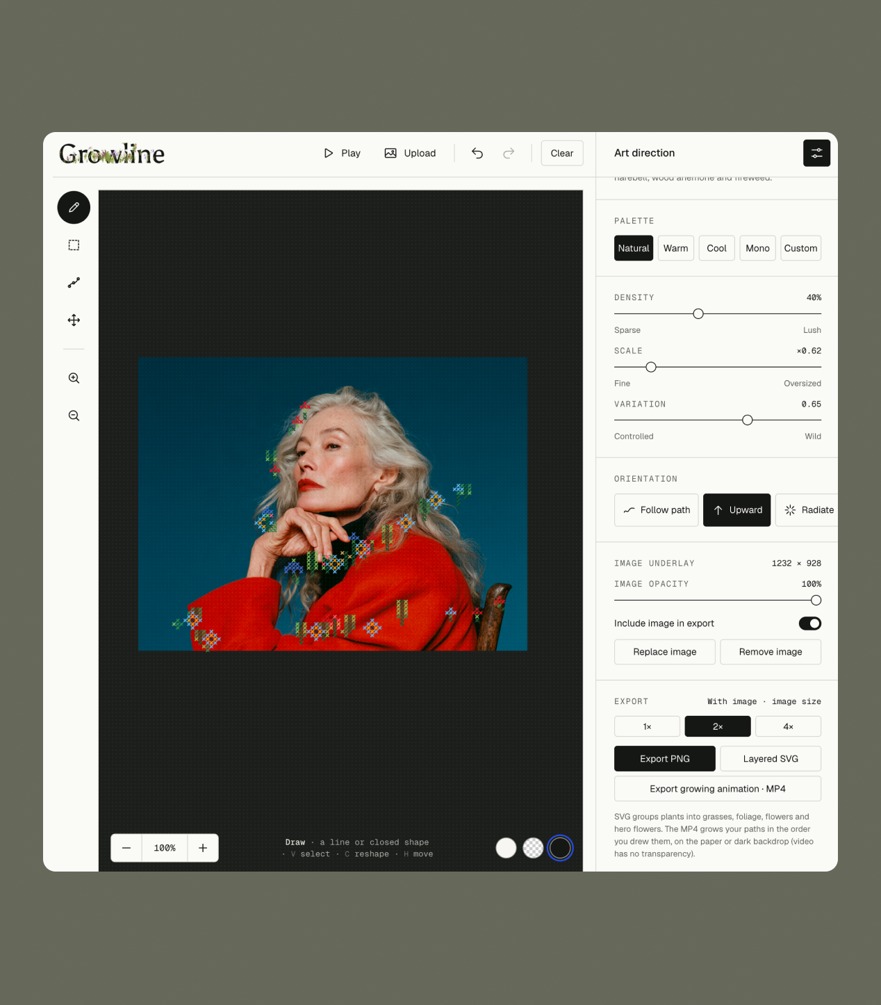
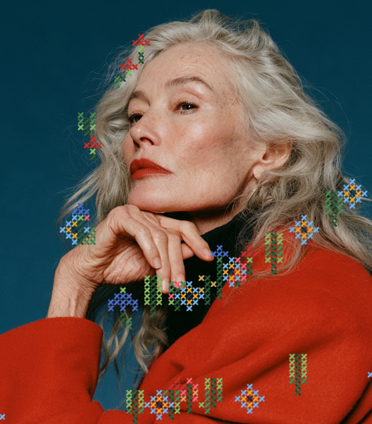
Growline
Draw a line. Let it grow.
A test of using AI to build a visual tool, and to explore how tools like this could become part of a client handover alongside brand guidelines.
Product
One Shelf, One Family
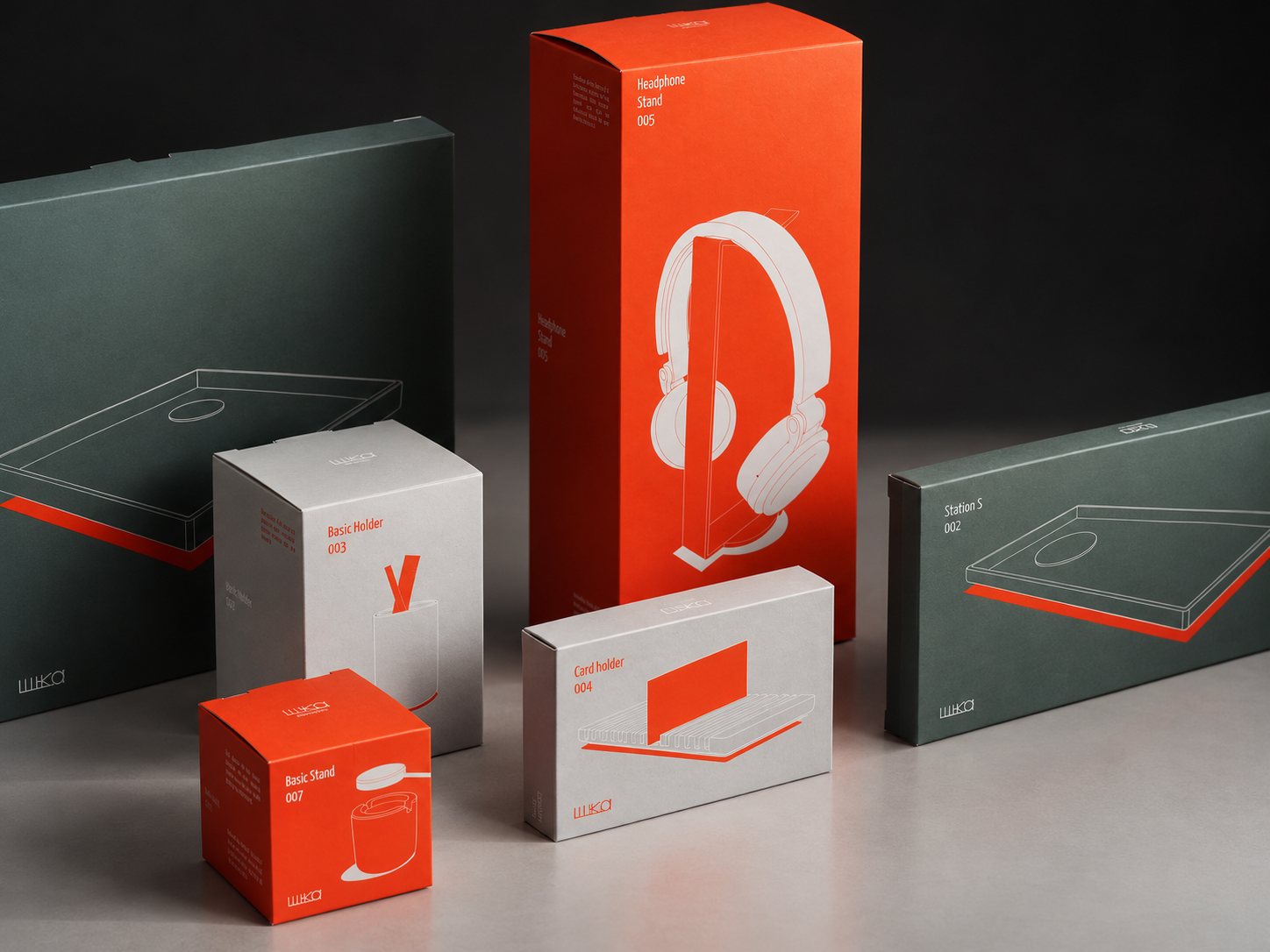
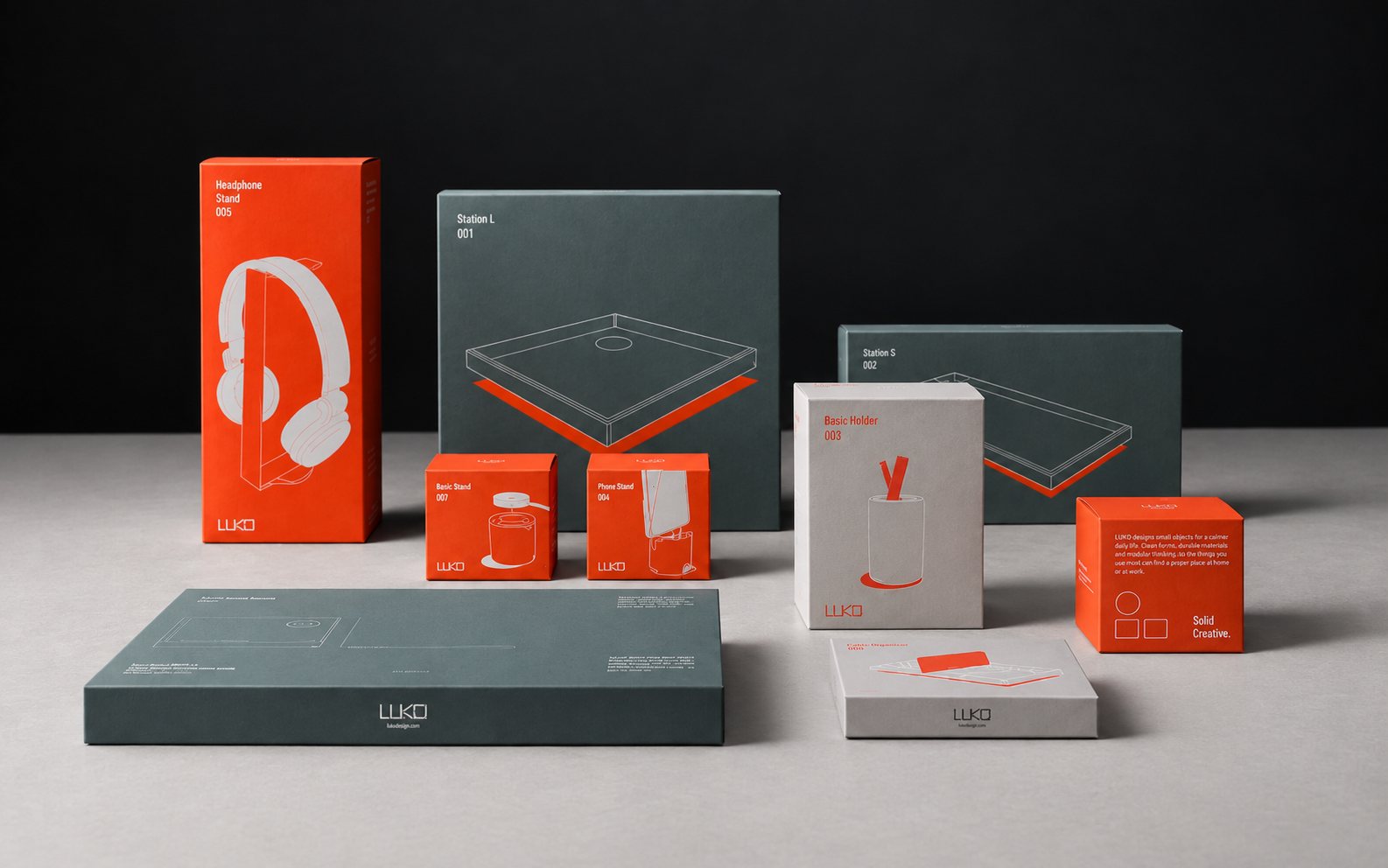
One Shelf, One Family
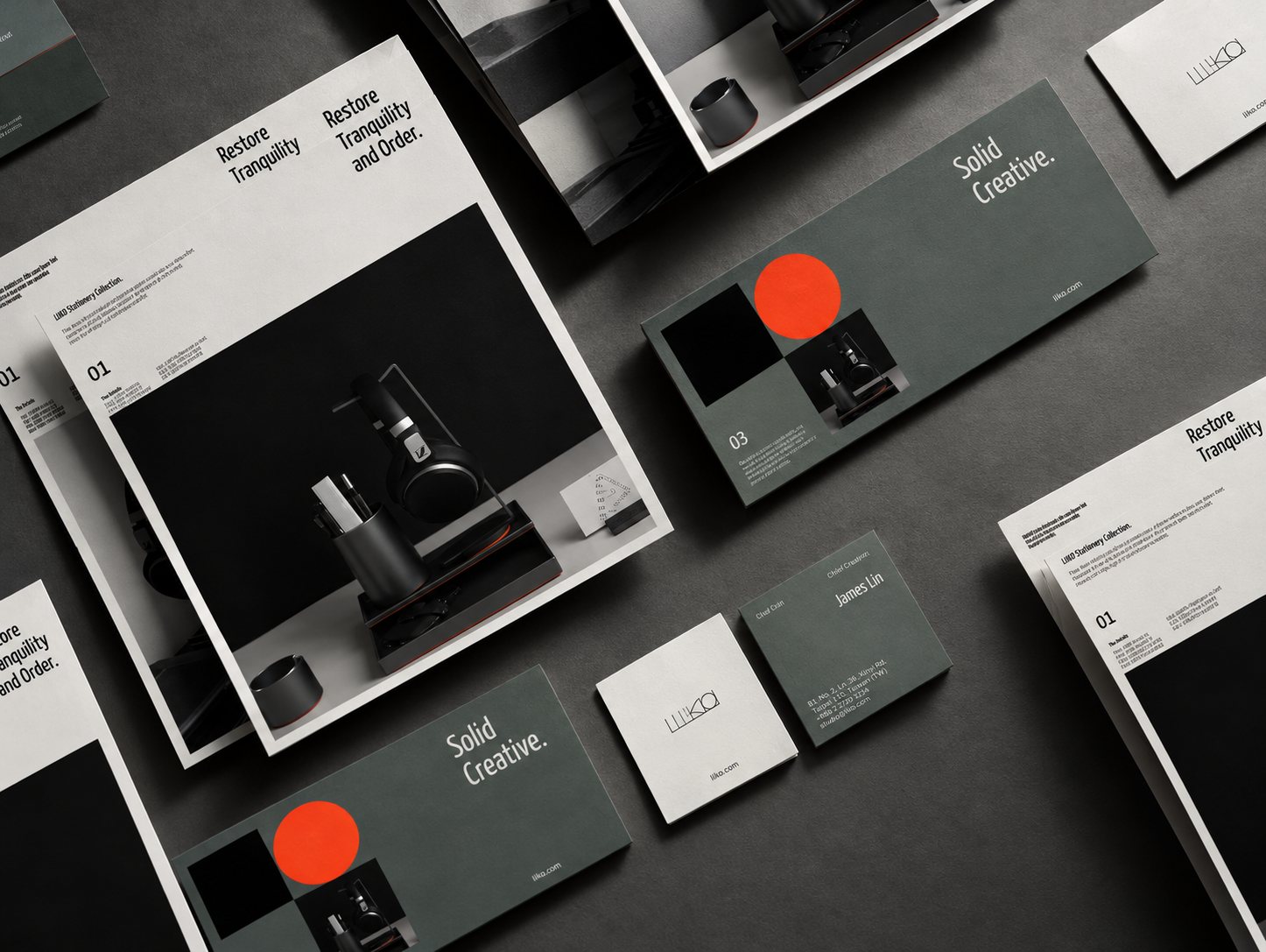
A packaging system for LIIKO’s range of stations, stands and desktop objects.
Brand
One Wrap, Any Size
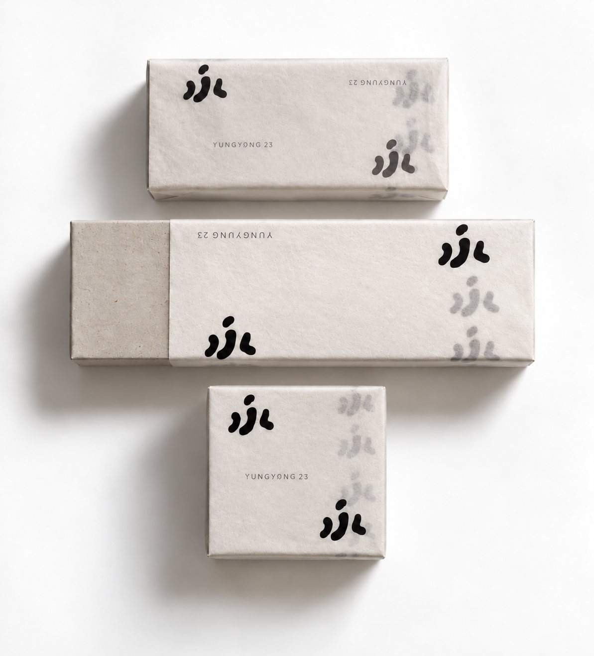
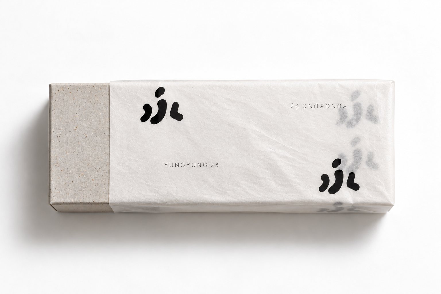
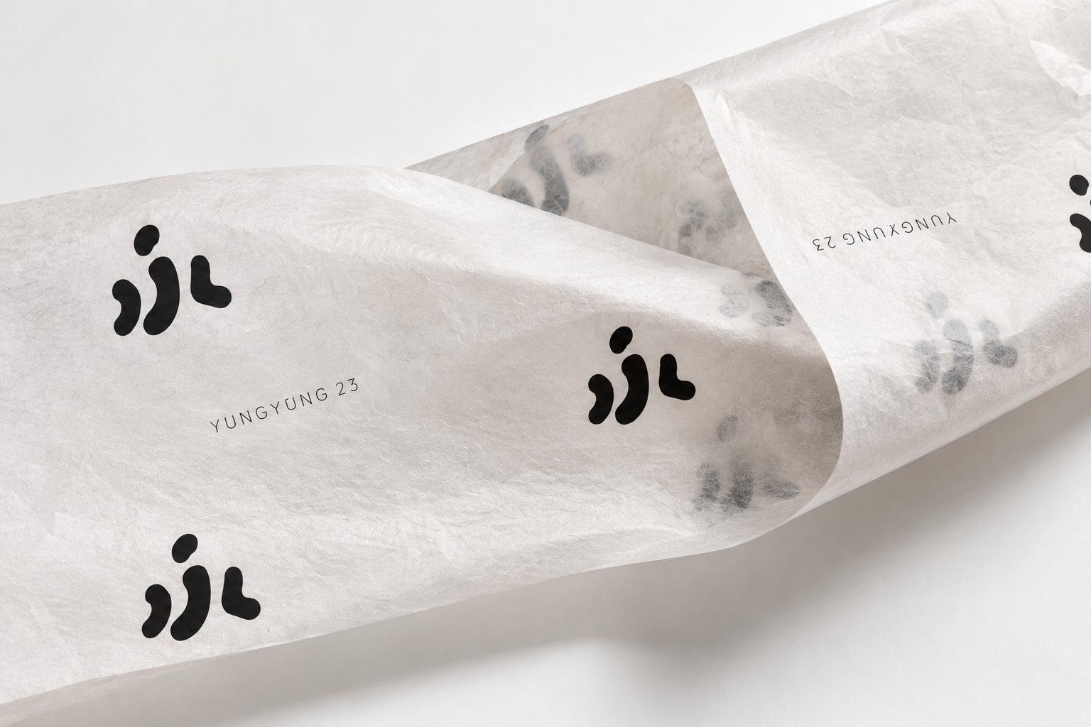
One Wrap, Any Size
A packaging system that could work across different products without requiring a separate printed box or sleeve for each size.
Brand

Ethical UI sketch
Ethical UI sketch
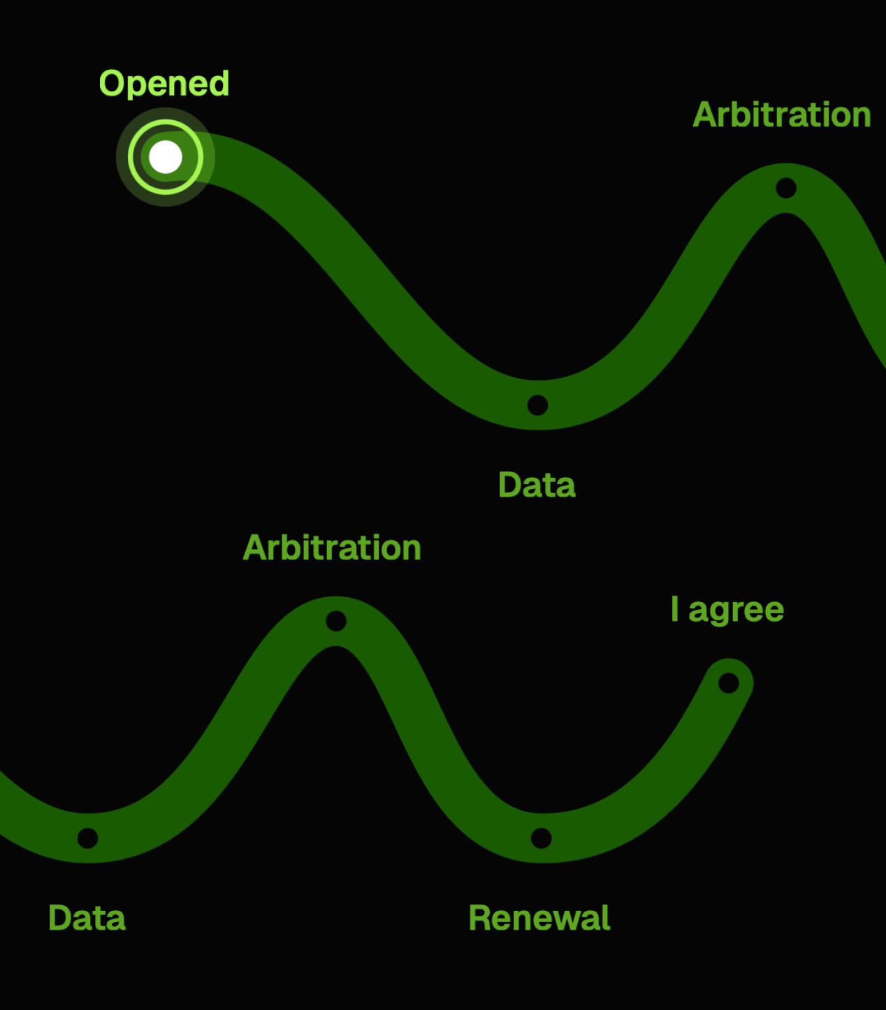
Most interfaces make “I agree” effortless. I explored five fun interactions that slow consent down on purpose: making it more visible, intentional and transparent. The question is simple: can a slower “I agree” build more trust?
Notebook
Between Two Cultures
Between Two Cultures
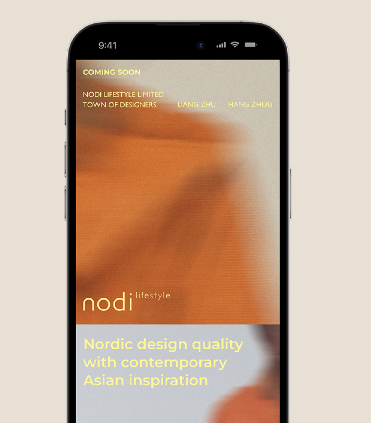
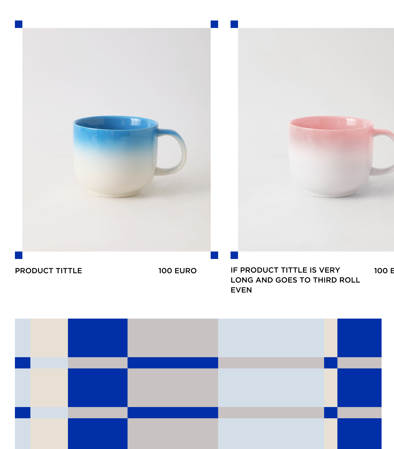
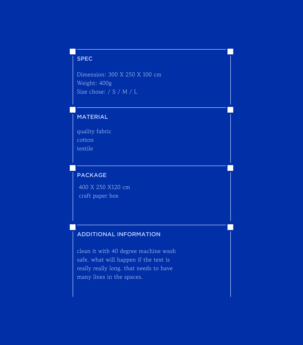
Nodi brings Nordic and Asian design together. I translated that idea into a flexible digital system using a restrained grid, generous space, bold colour blocks, and asymmetrical layouts—creating an experience that feels minimal, editorial, and slightly unexpected.
Product
Old Symbols, New Rhythm
Old Symbols, New Rhythm
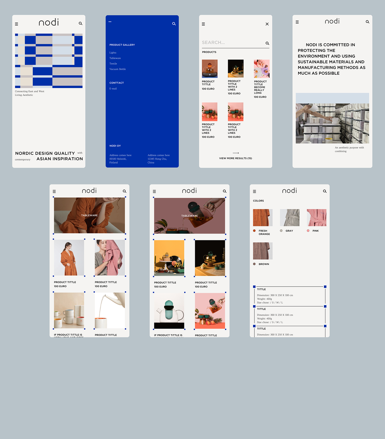
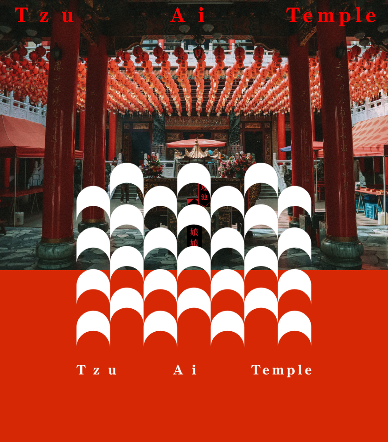
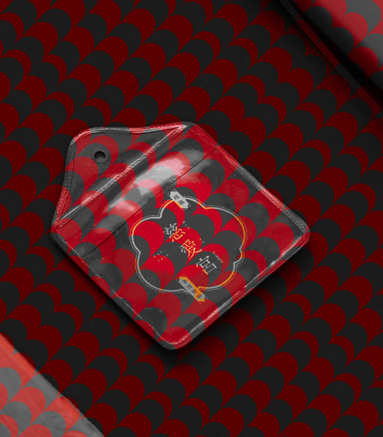
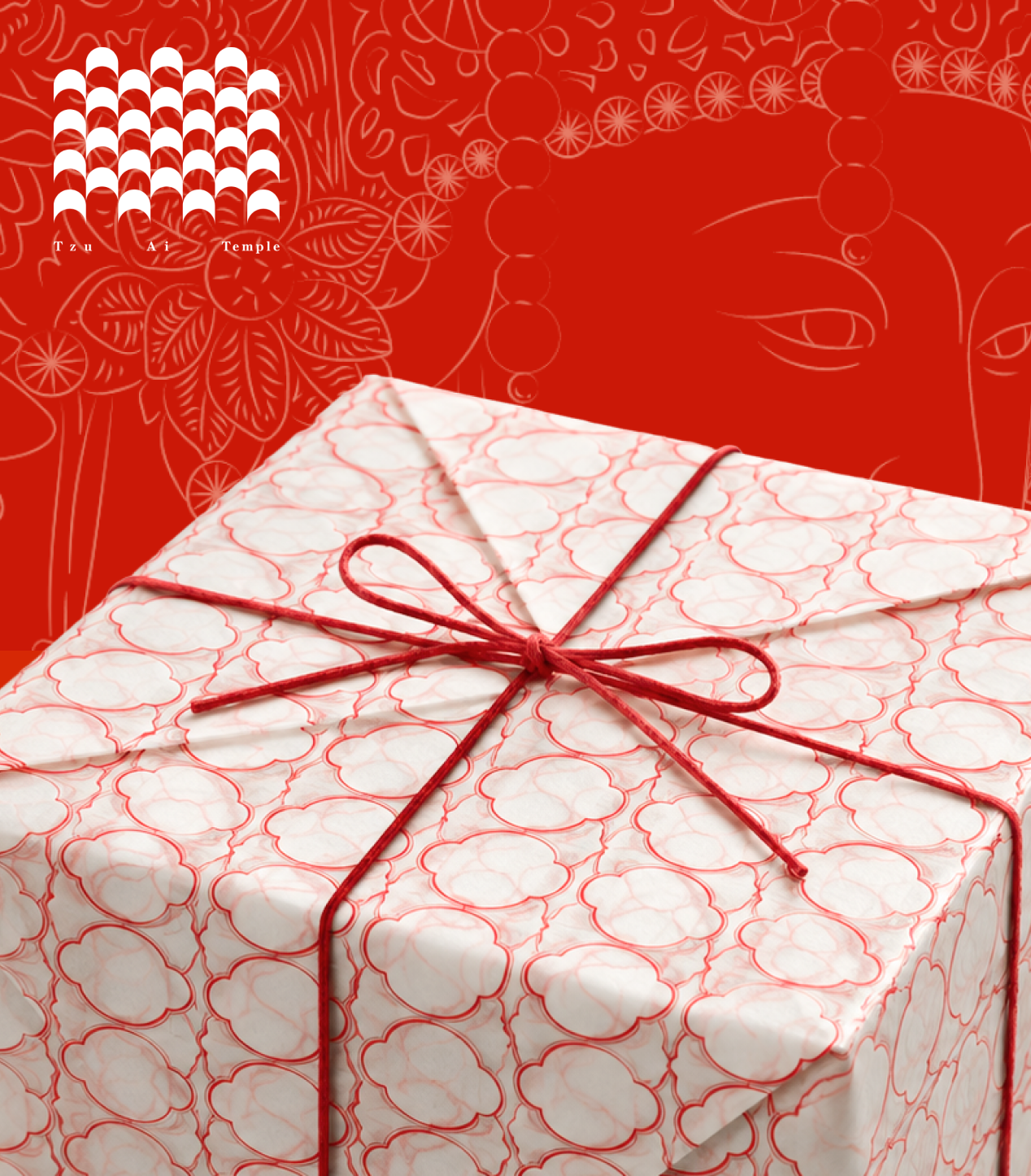
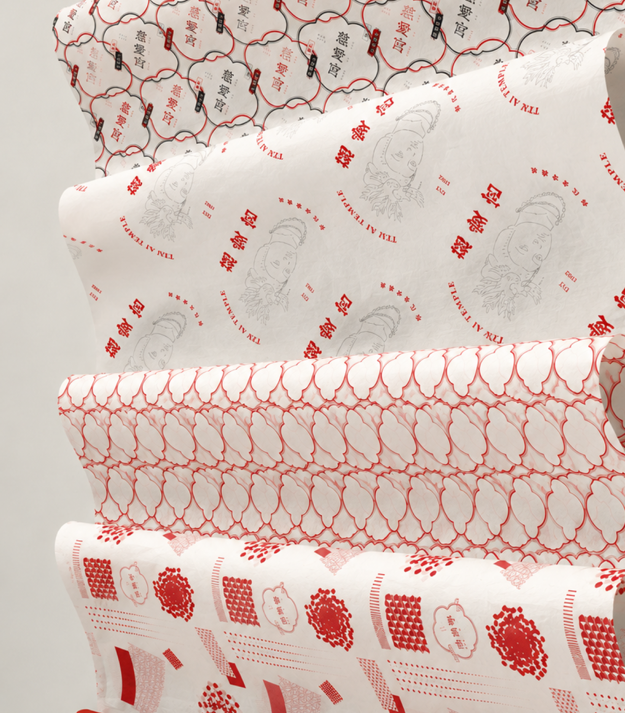
Reworked traditional Taiwanese temple imagery into a flexible graphic system of simplified forms, repeated patterns, and bold compositions.
Brand
One Mark, Many Forms
One Mark, Many Forms
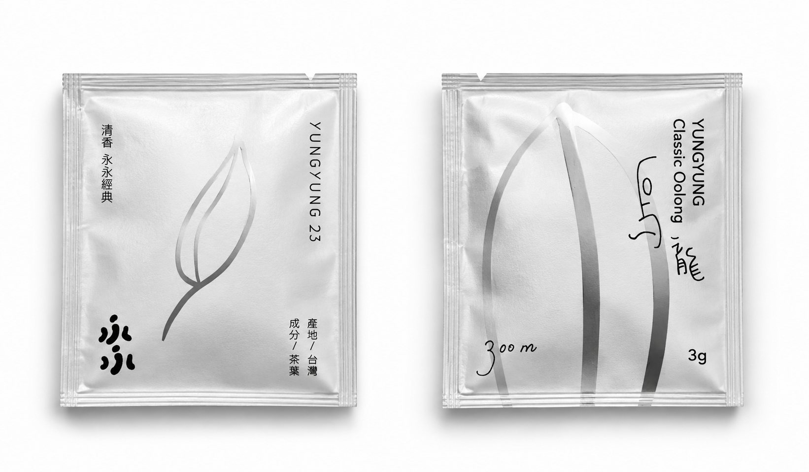
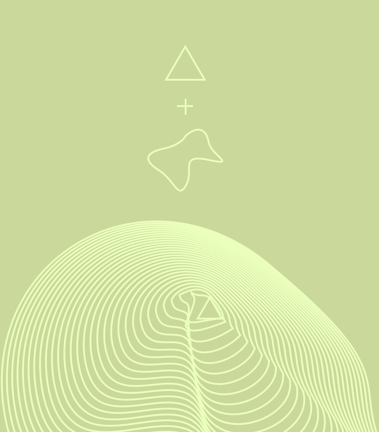
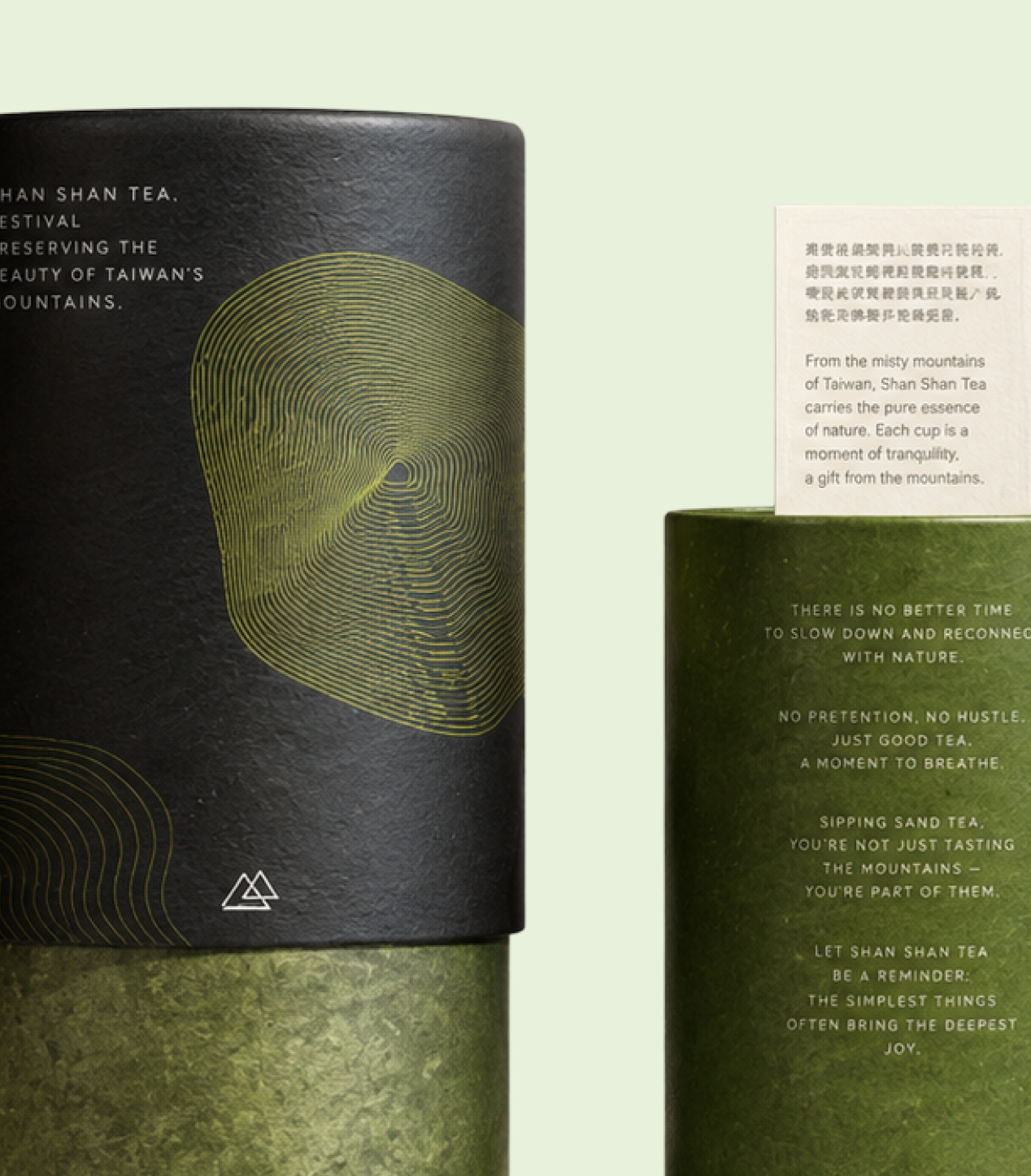
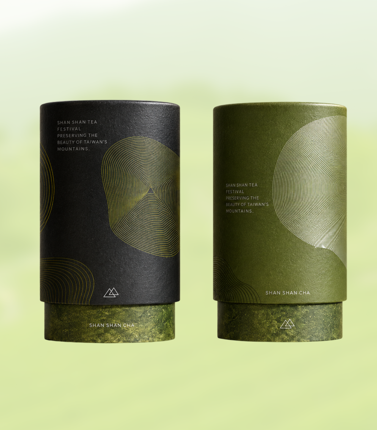
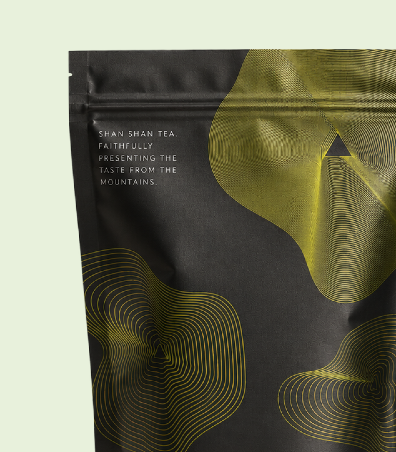
Shan Shan wanted to keep its existing logo while giving the identity more room to evolve. I combined the triangular mark with topographic contour lines to create a flexible pattern system that could shift across formats, scales, and applications, then extended it into a new series of tea tin packaging.
Brand
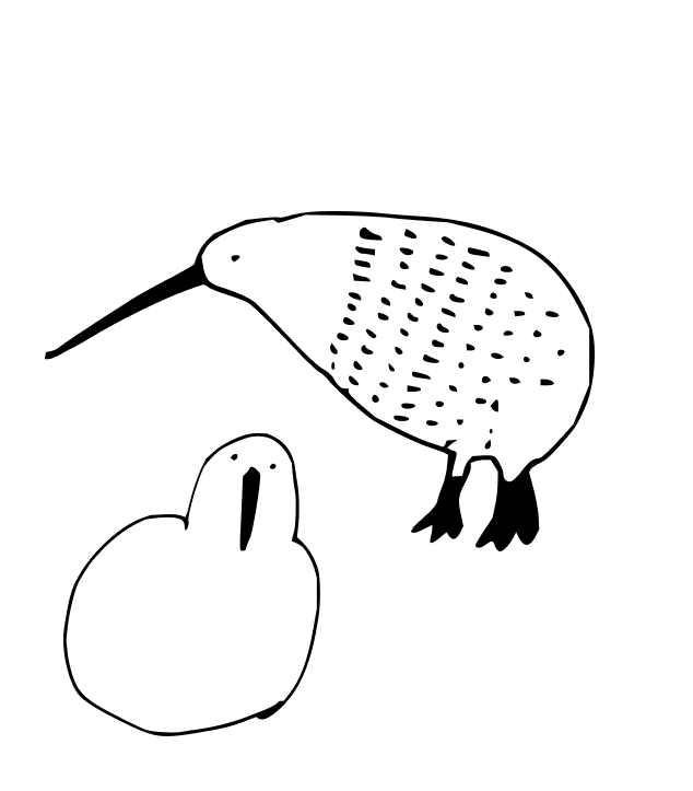
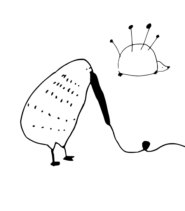
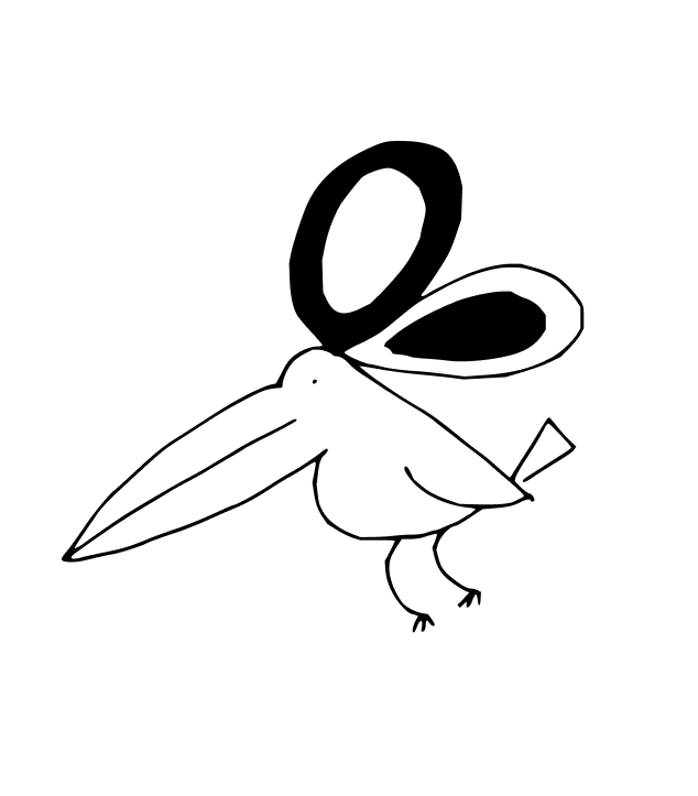
TIKKI
TIKKI
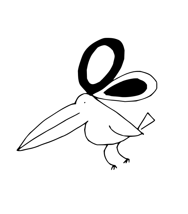
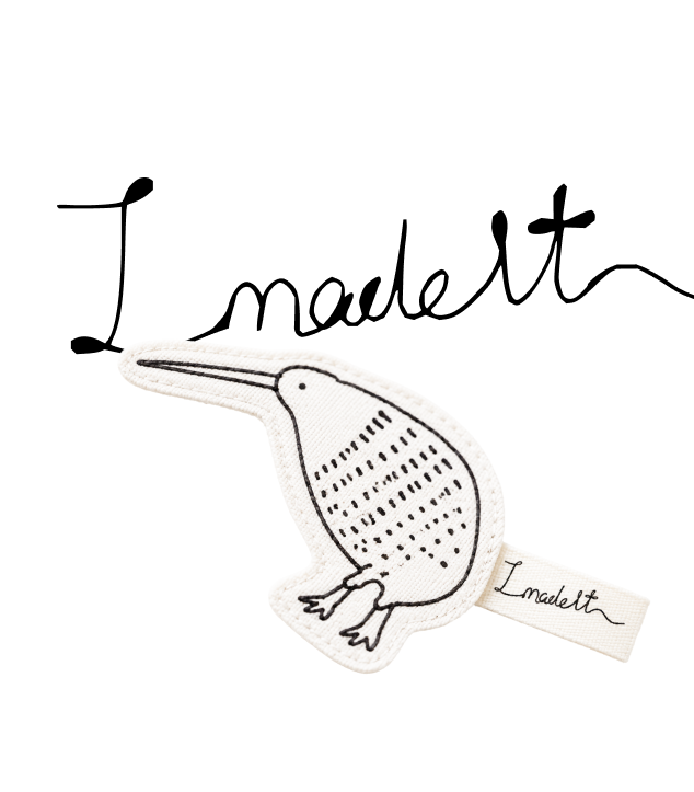
For Tikki, I mixed sewing tools with New Zealand birds to create a set of playful label illustrations: small characters that reflect both the joy of making and the studio’s local identity.
Notebook
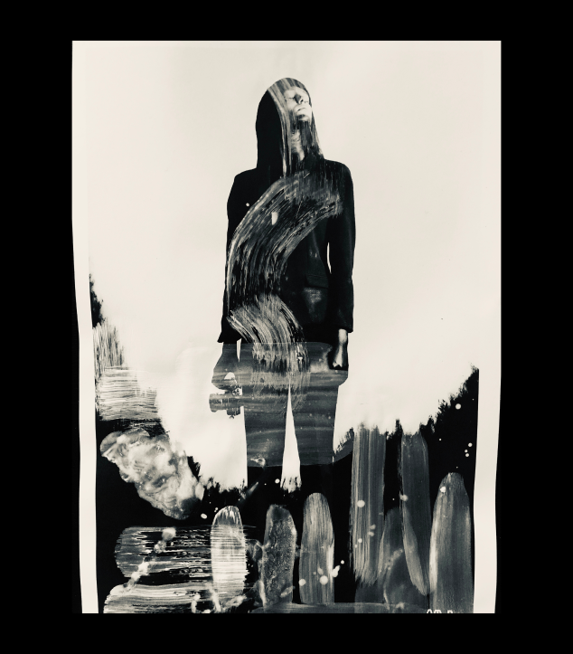
Pixels are useful. Ink is unpredictable. I like both.
Pixels are useful. Ink is unpredictable. I like both.
The world keeps getting more digital.
I still like ink on my fingers.
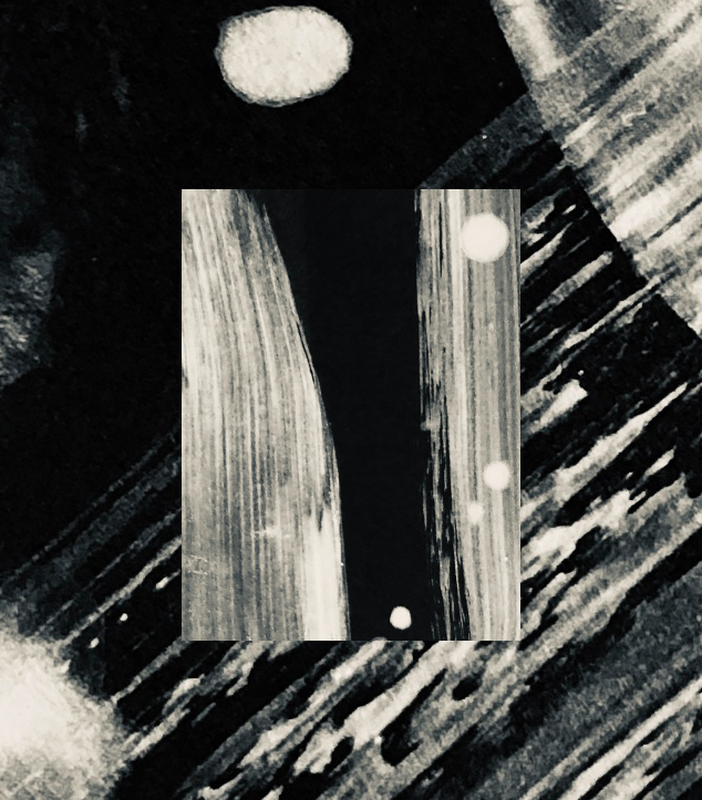
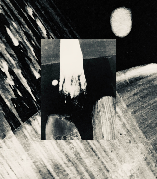
A series of brush experiments exploring
gesture, texture and imperfection.
Notebook

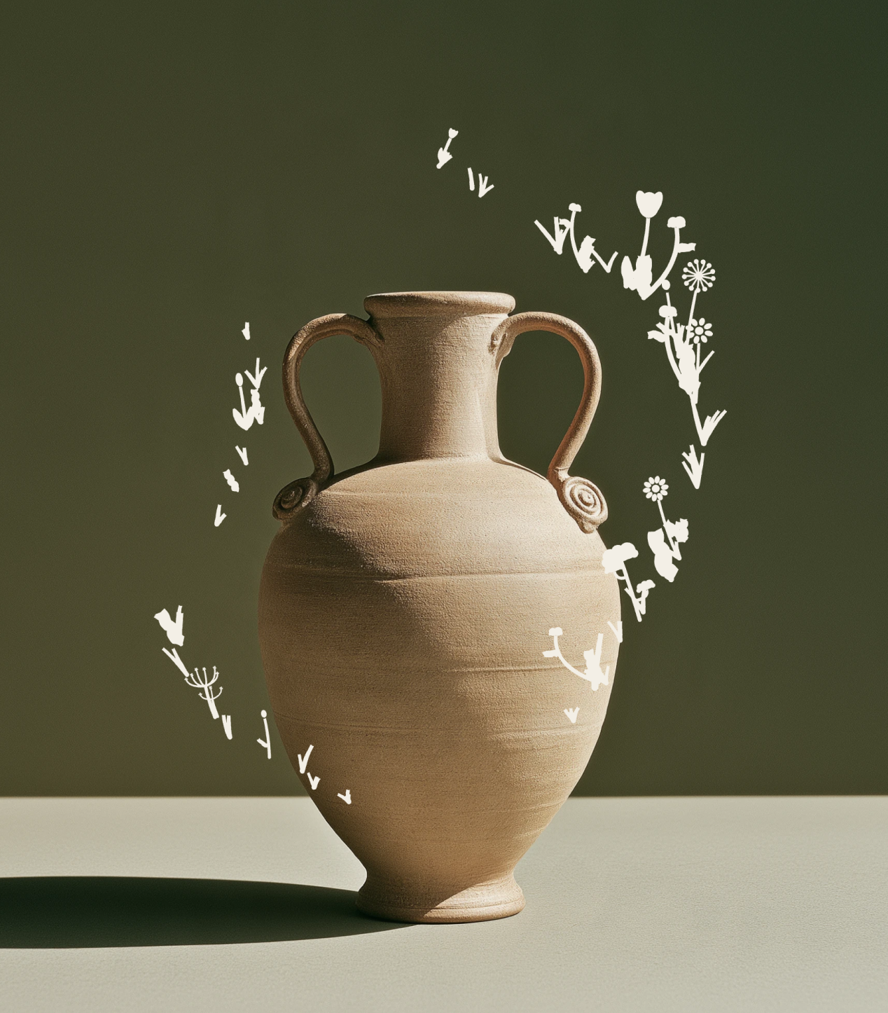
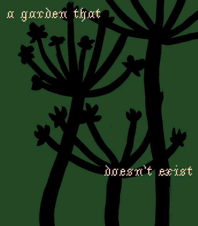
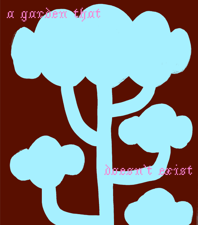
A garden that doesn't exist
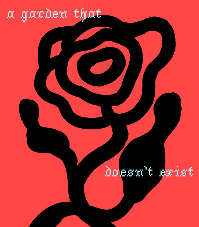
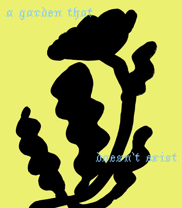
A garden that doesn't exist
These plants have no names.
They grow from gestures,
repetition and accidents—
somewhere between nature
and imagination.
A collection of invented flora.
Notebook
Balloon postcard concept
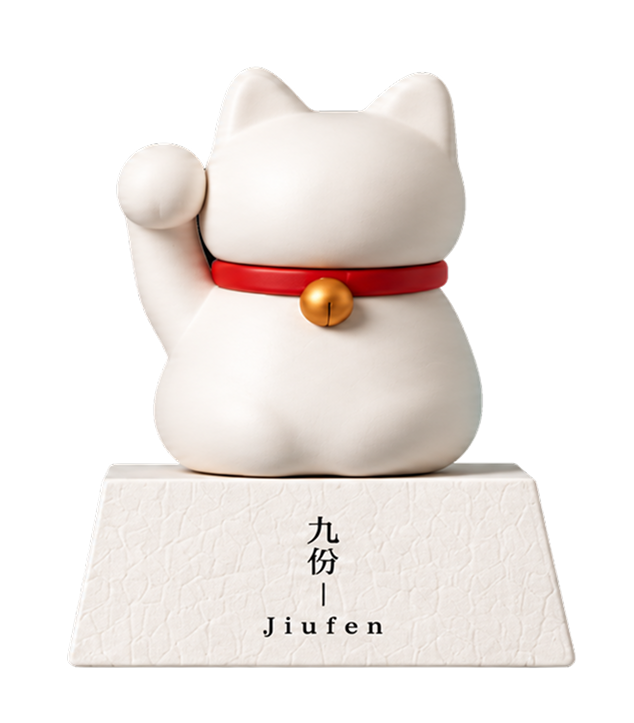
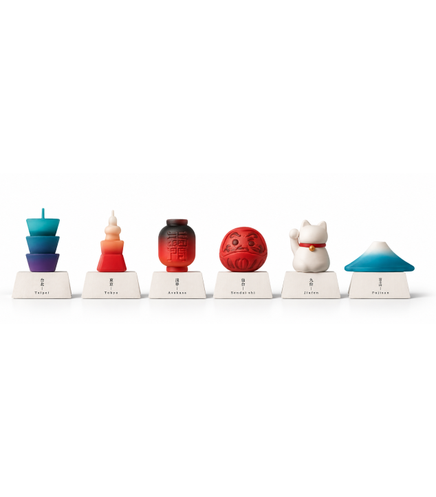
Balloon postcard concept
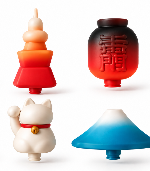
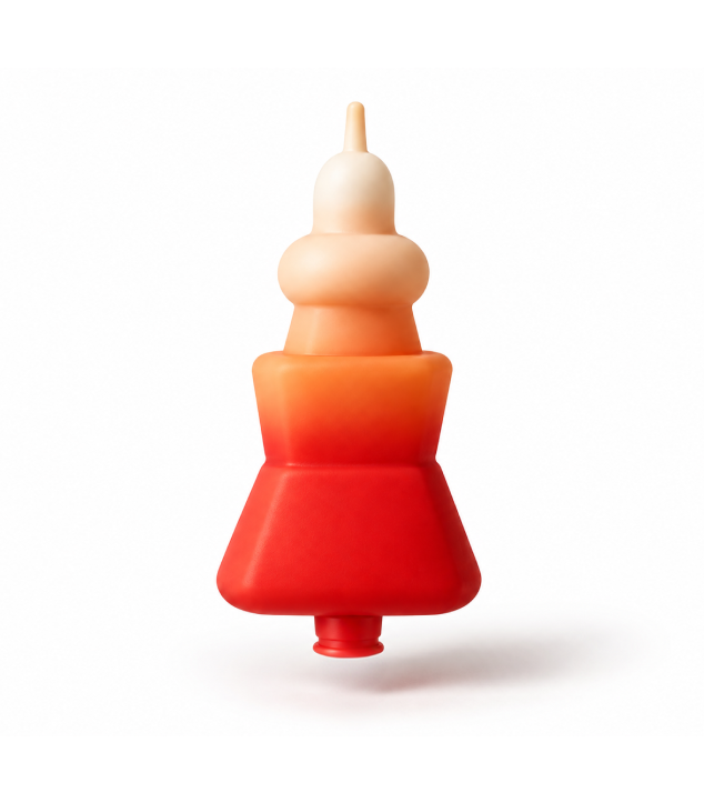
A concept for Sumida City, Tokyo, created with a local balloon manufacturer. Landmark-shaped balloons stand on postcards, turning a simple souvenir into a playful piece of art.
Product
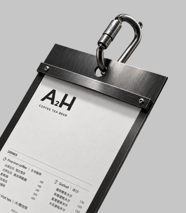
A2H branding
A2H branding
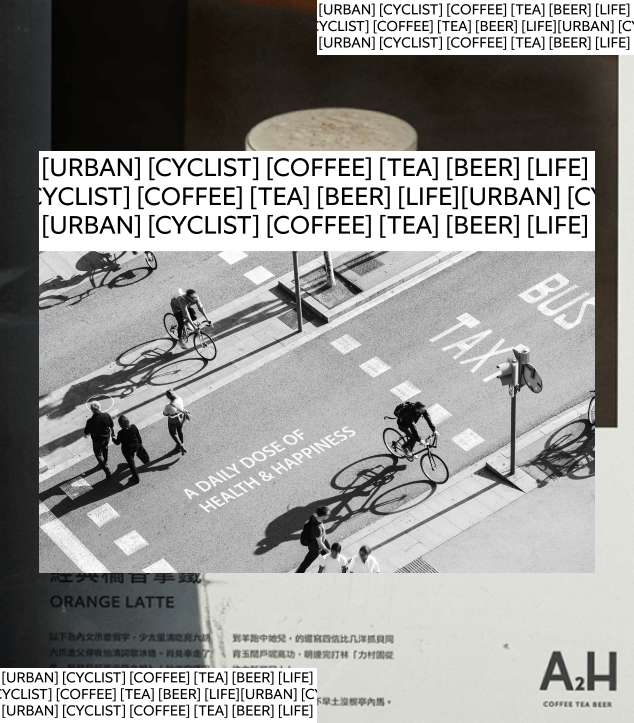
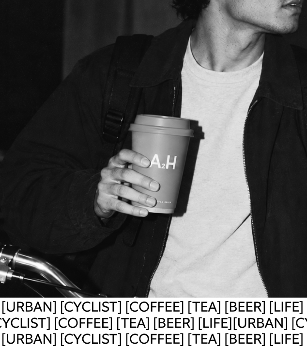
A2H stands for “Amazing Healthy and Happy Lifestyle.” Created as a café-bar for urban cycling enthusiasts, the brand brings together bicycles, food, and a positive approach to everyday living.
The project focused on creating a minimal and flexible visual identity system that could express A2H’s energetic, healthy, and urban character across different touchpoints.
Brand
Rice story logo
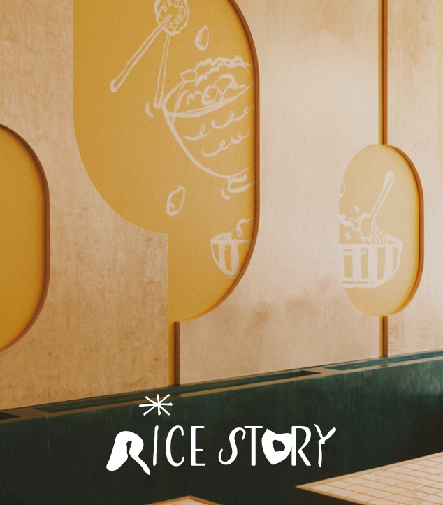
Rice story logo
Rice Story is a Helsinki-based restaurant built around one of the simplest and most versatile ingredients: rice. The identity explores rice as a blank canvas: something that can take on different flavors, textures and cultural influences depending on how it is prepared. This idea became the foundation for a visual system that feels playful, expressive and constantly changing.
Brand