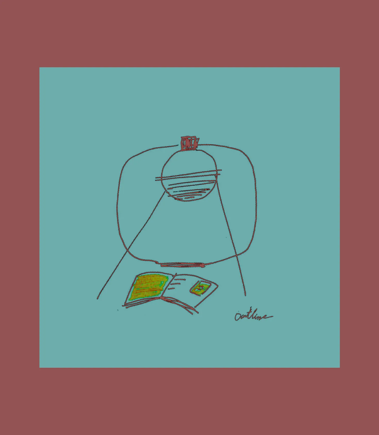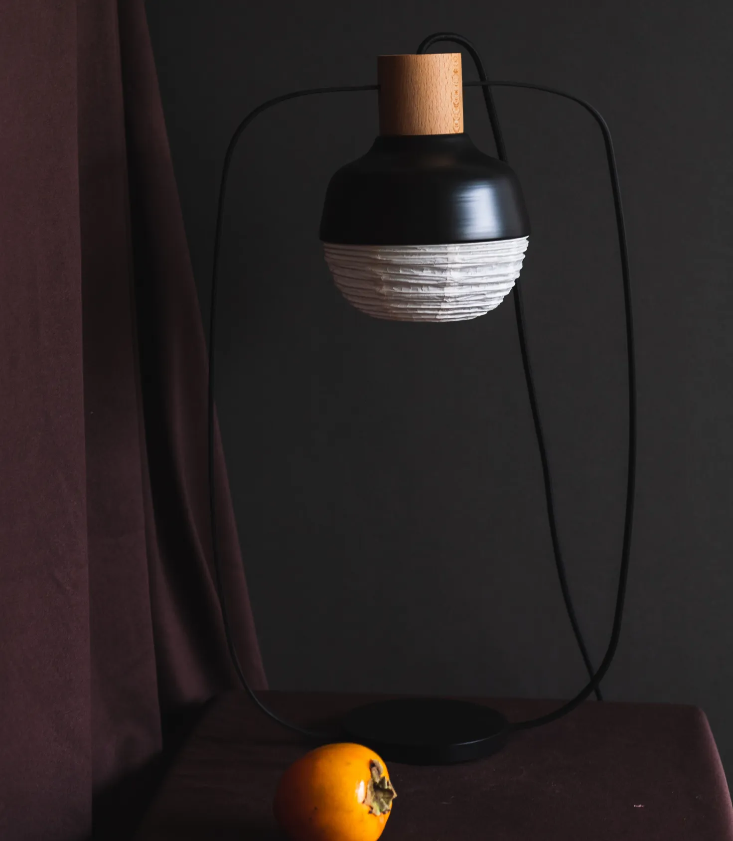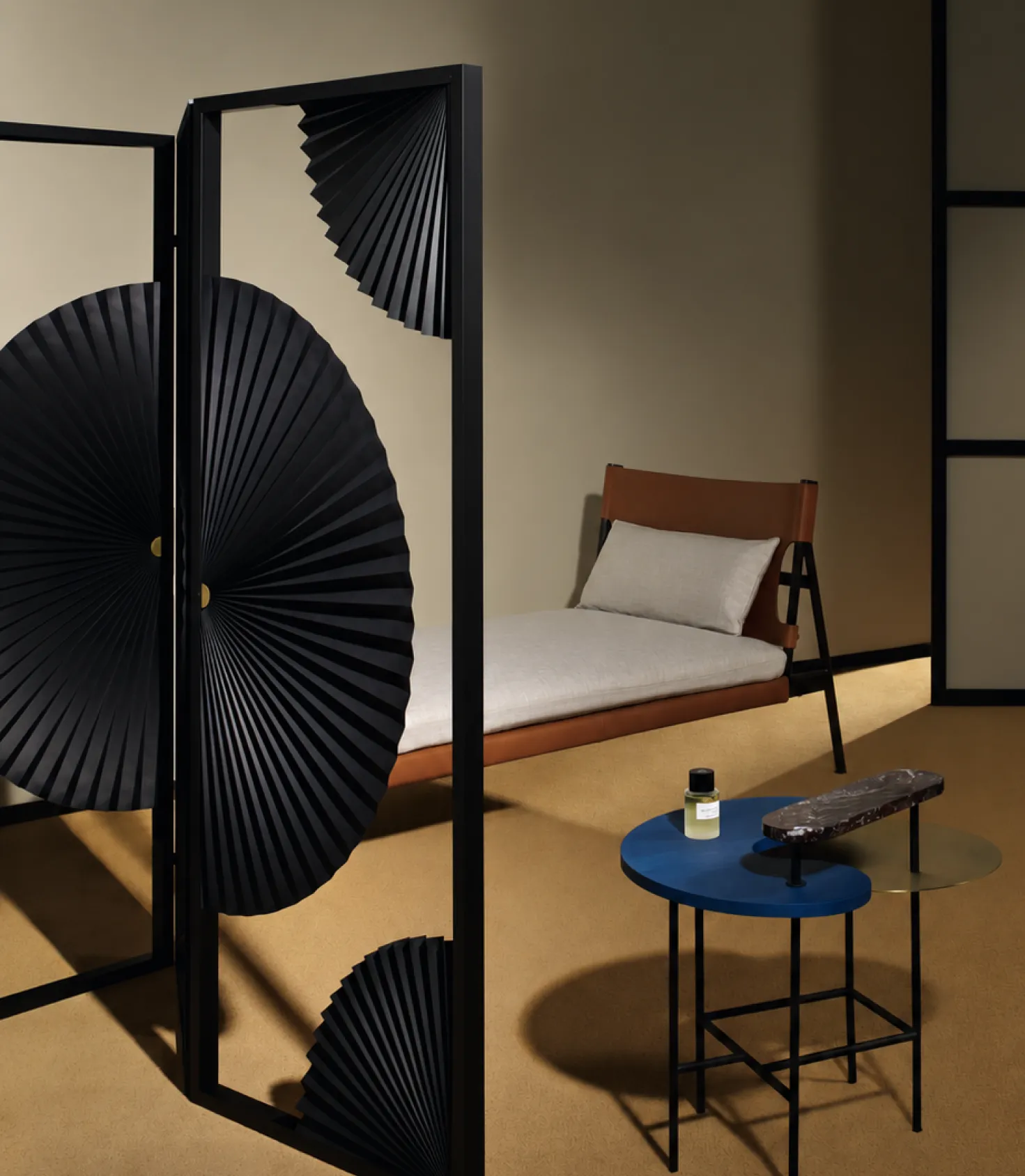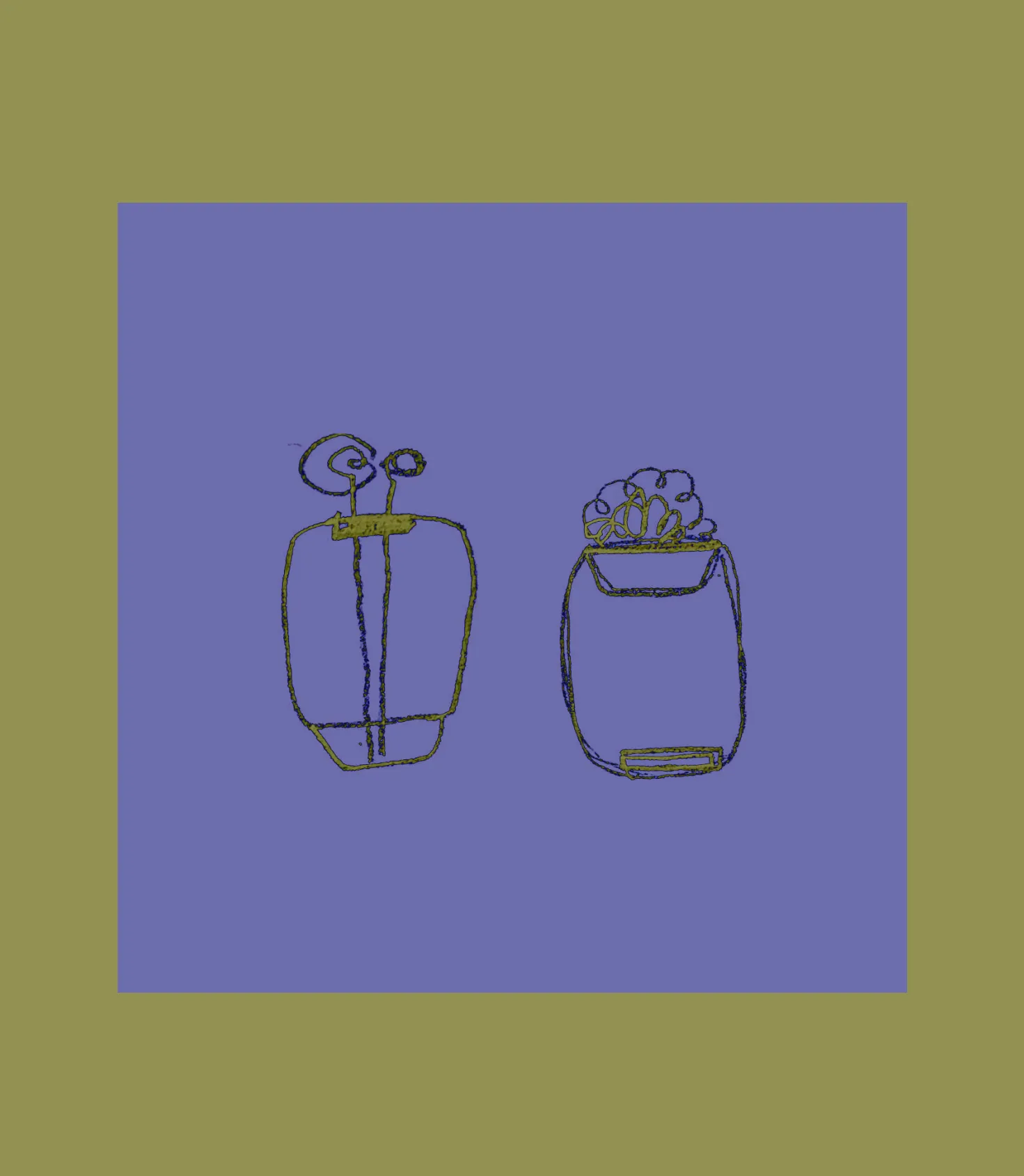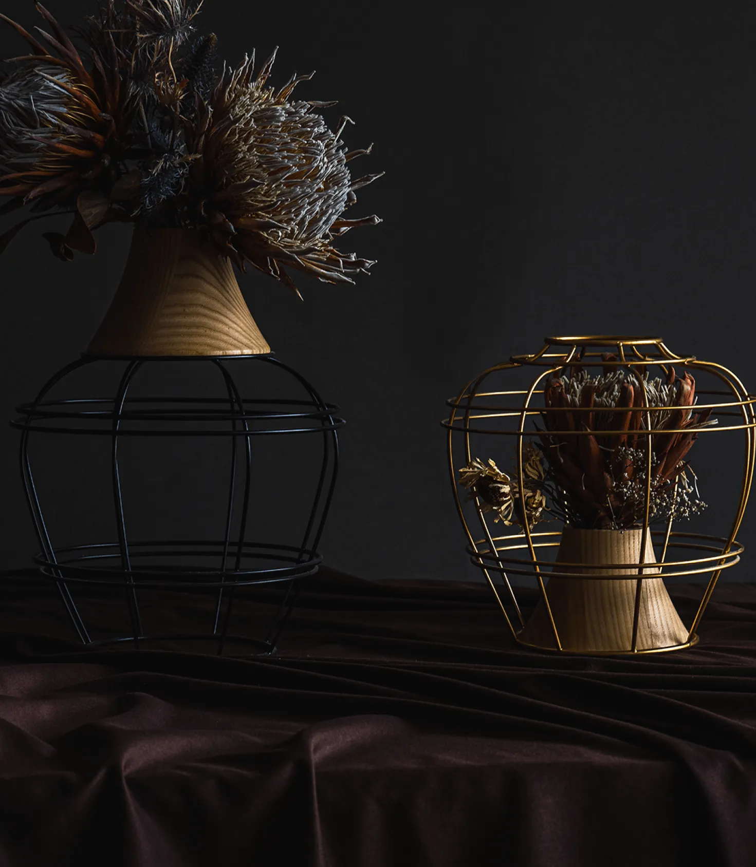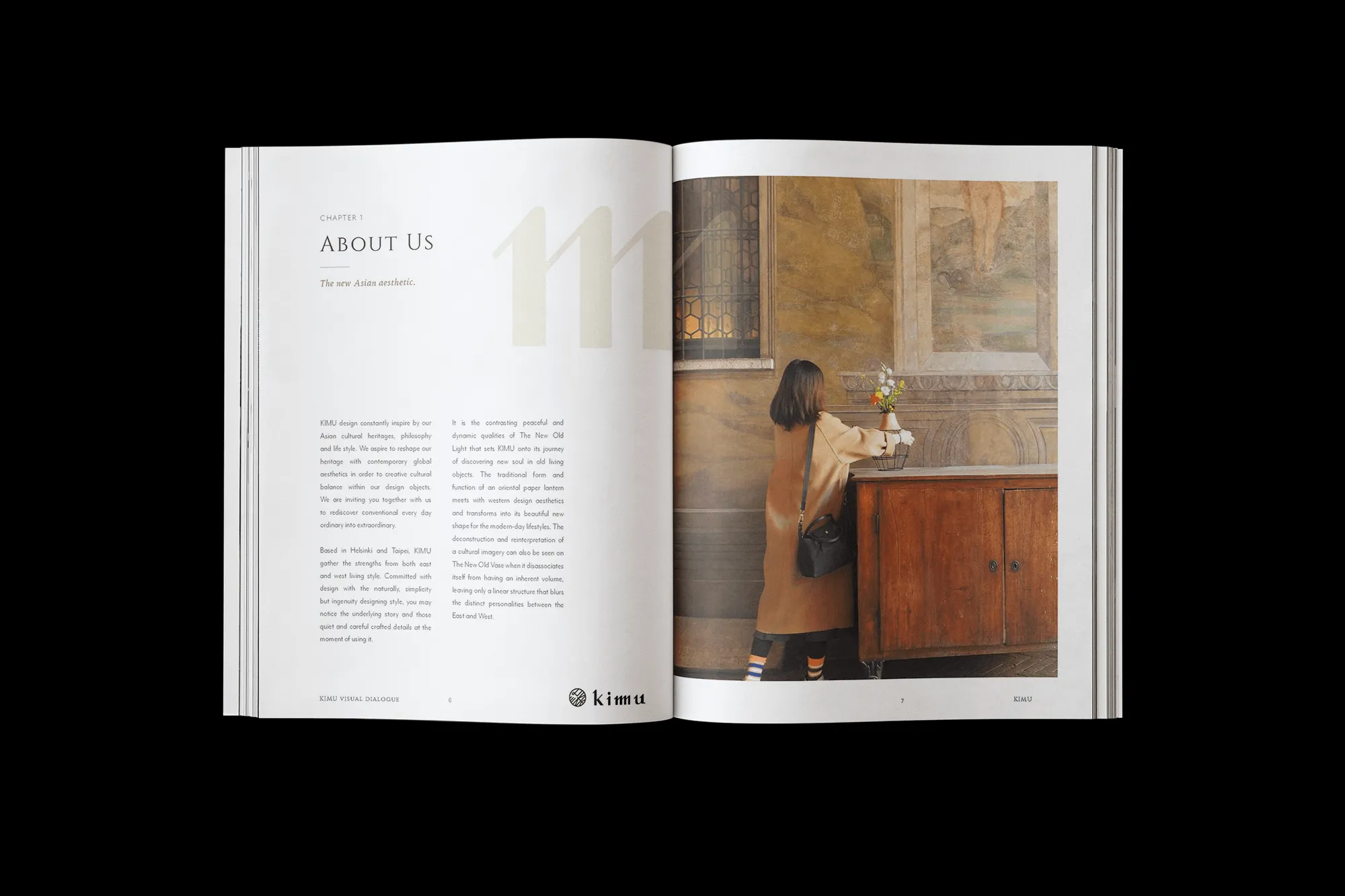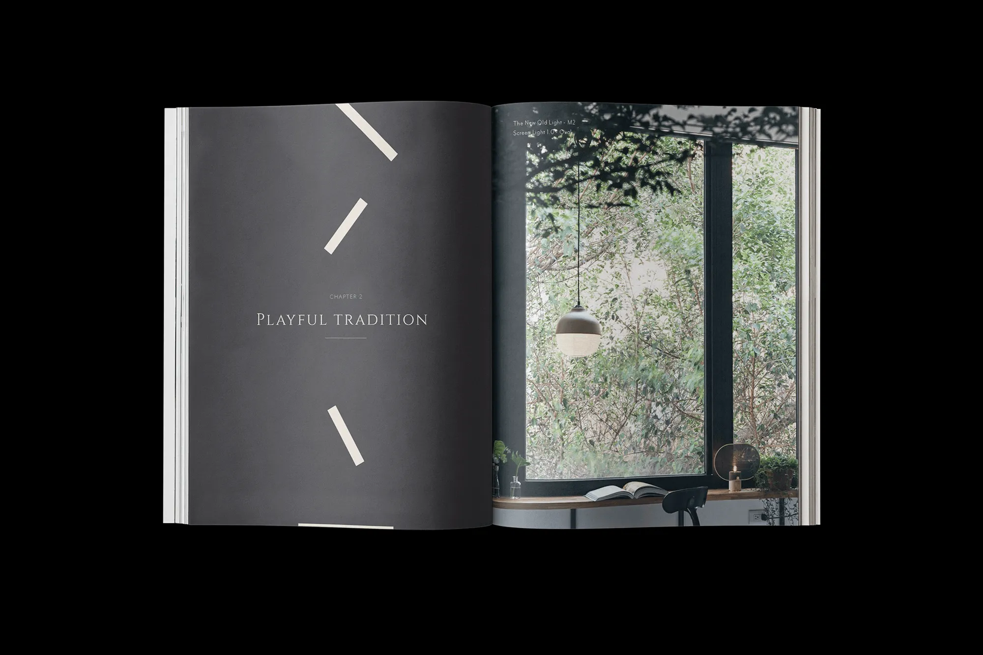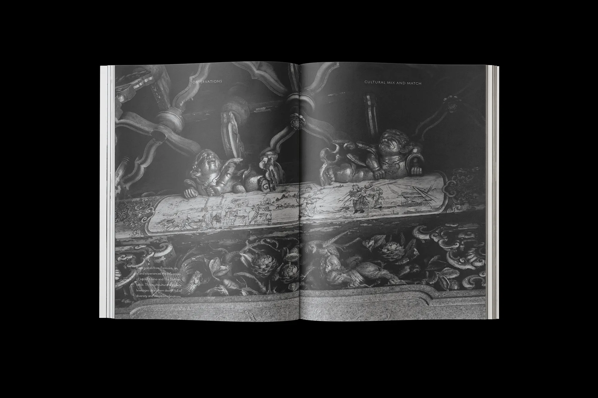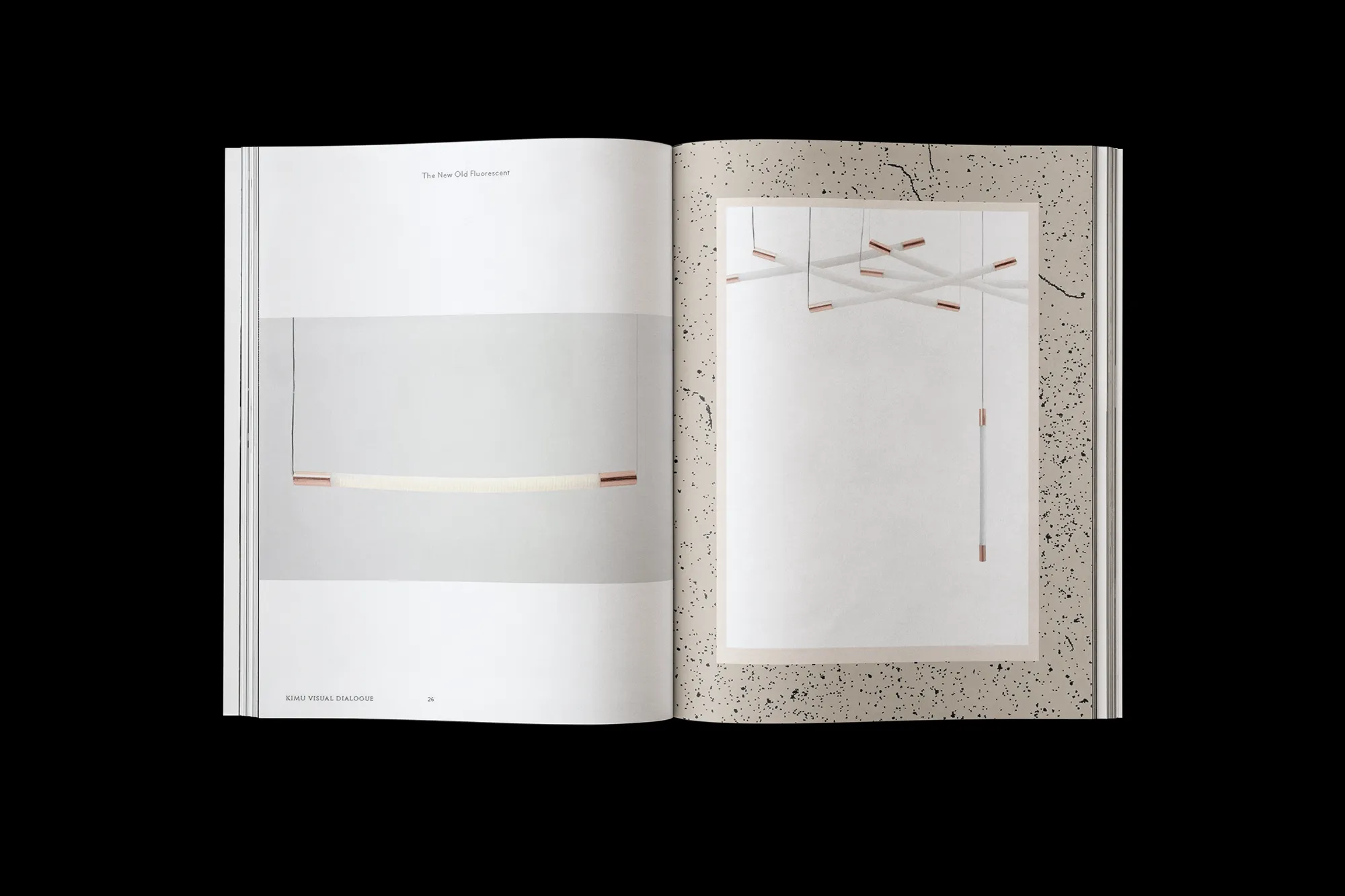
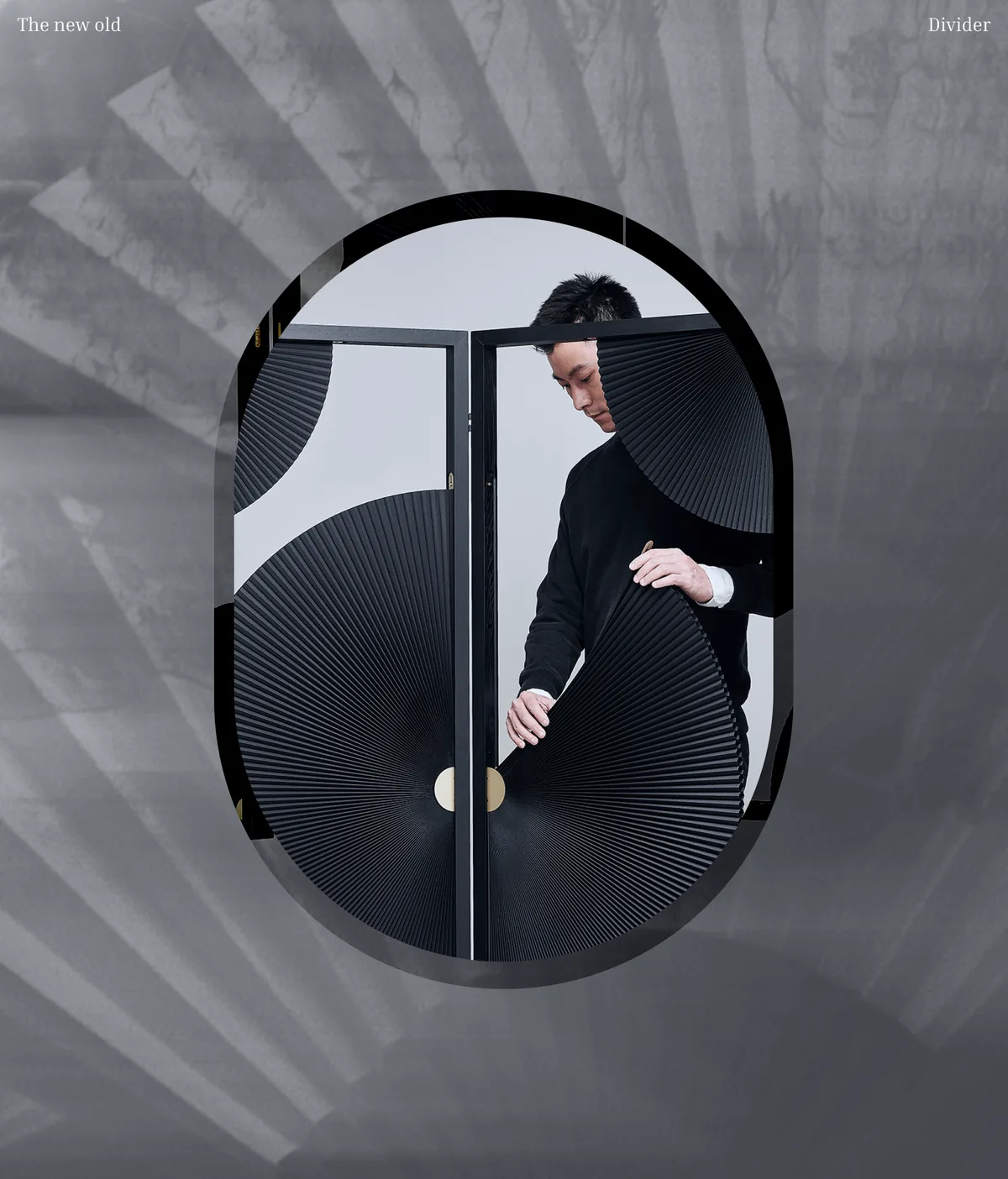
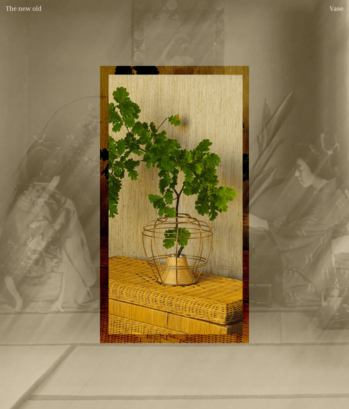
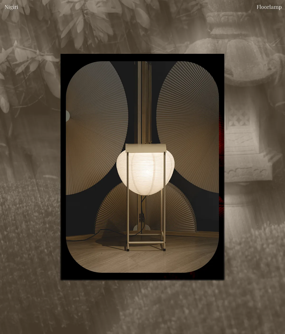
Tradition, reinterpreted rather than reproduced.
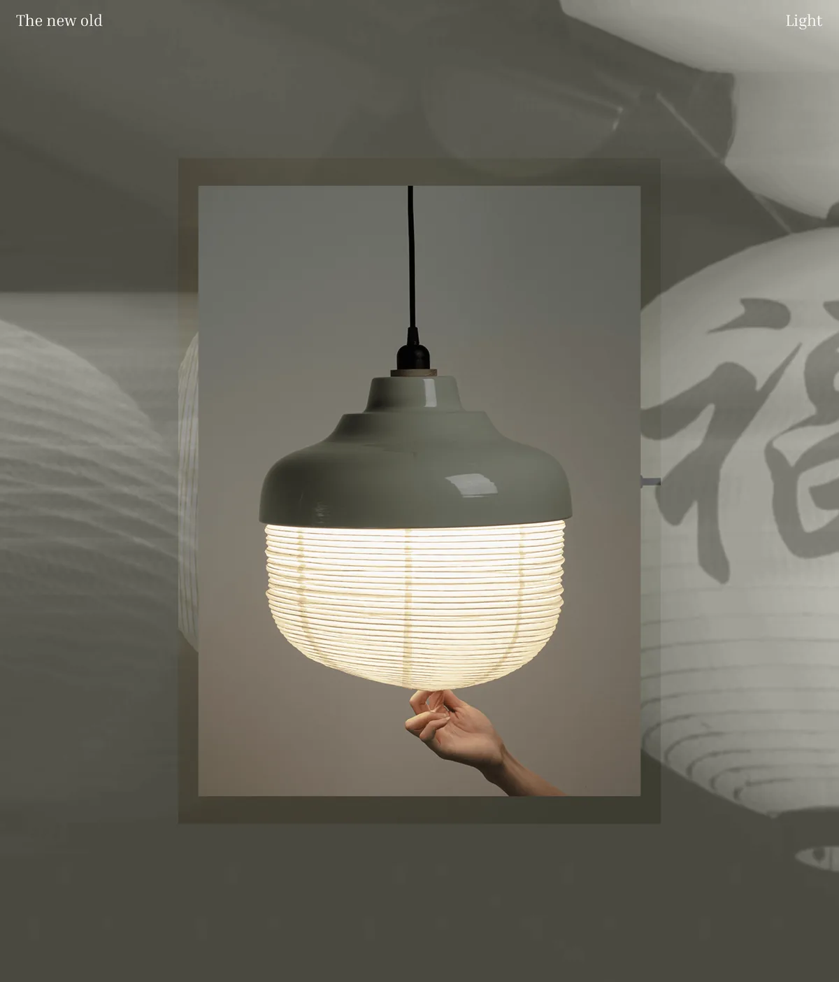
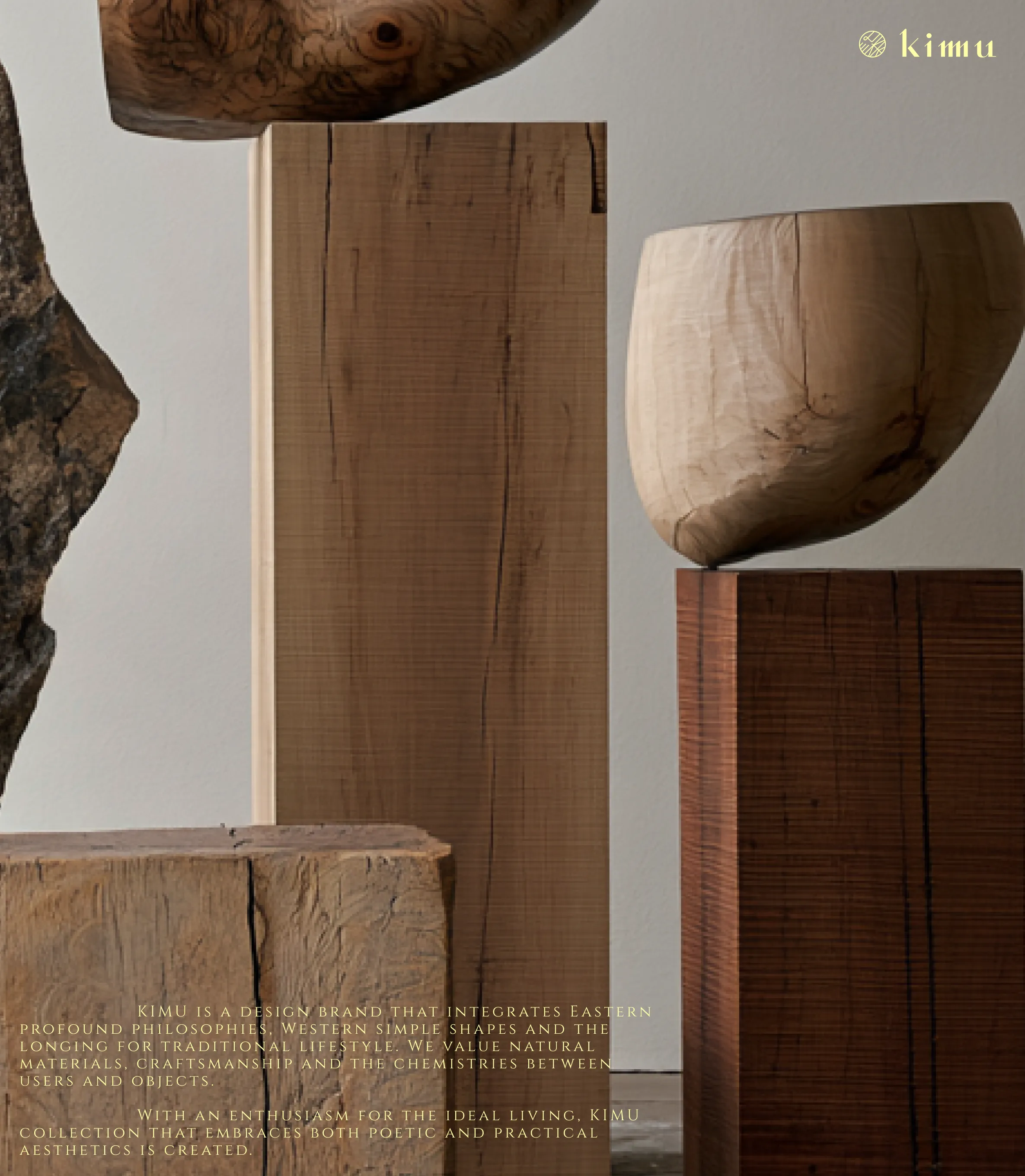
KIMU explores the meeting point between Asian culture and contemporary design.
KIMU explores the meeting point between Asian culture and contemporary design.
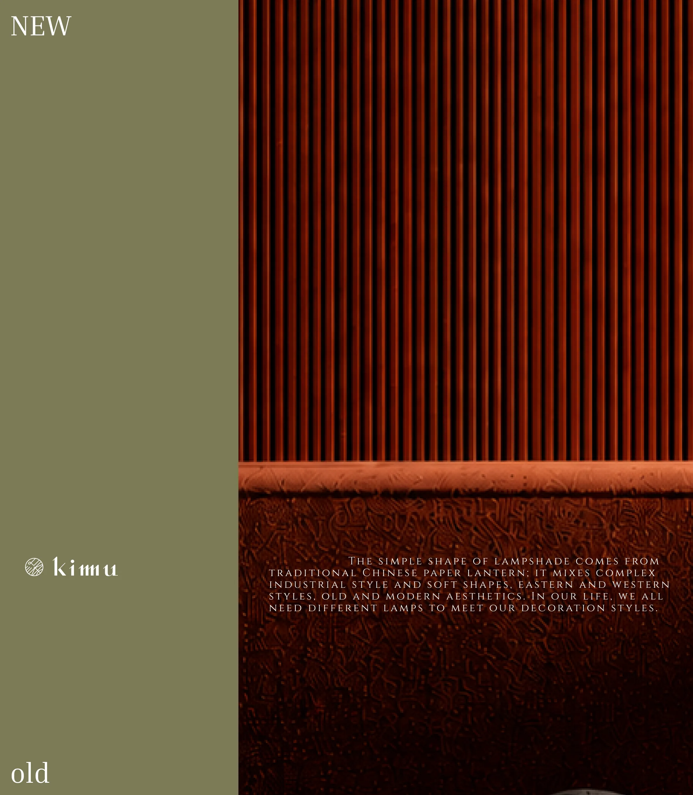
East × West
Traditional × Contemporary
Playful × Refined
Object × Space
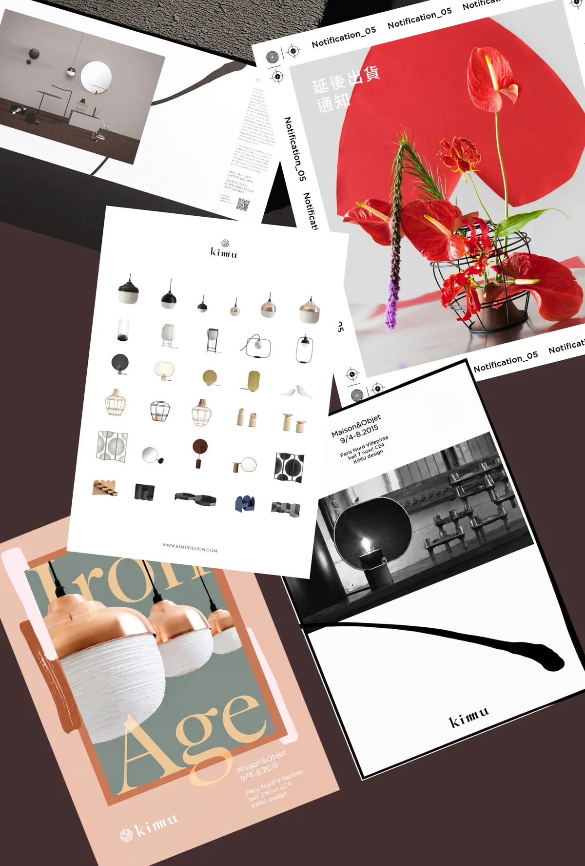
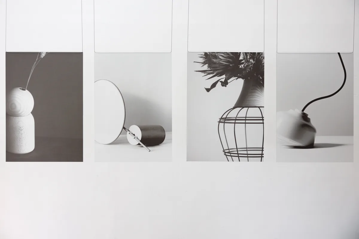
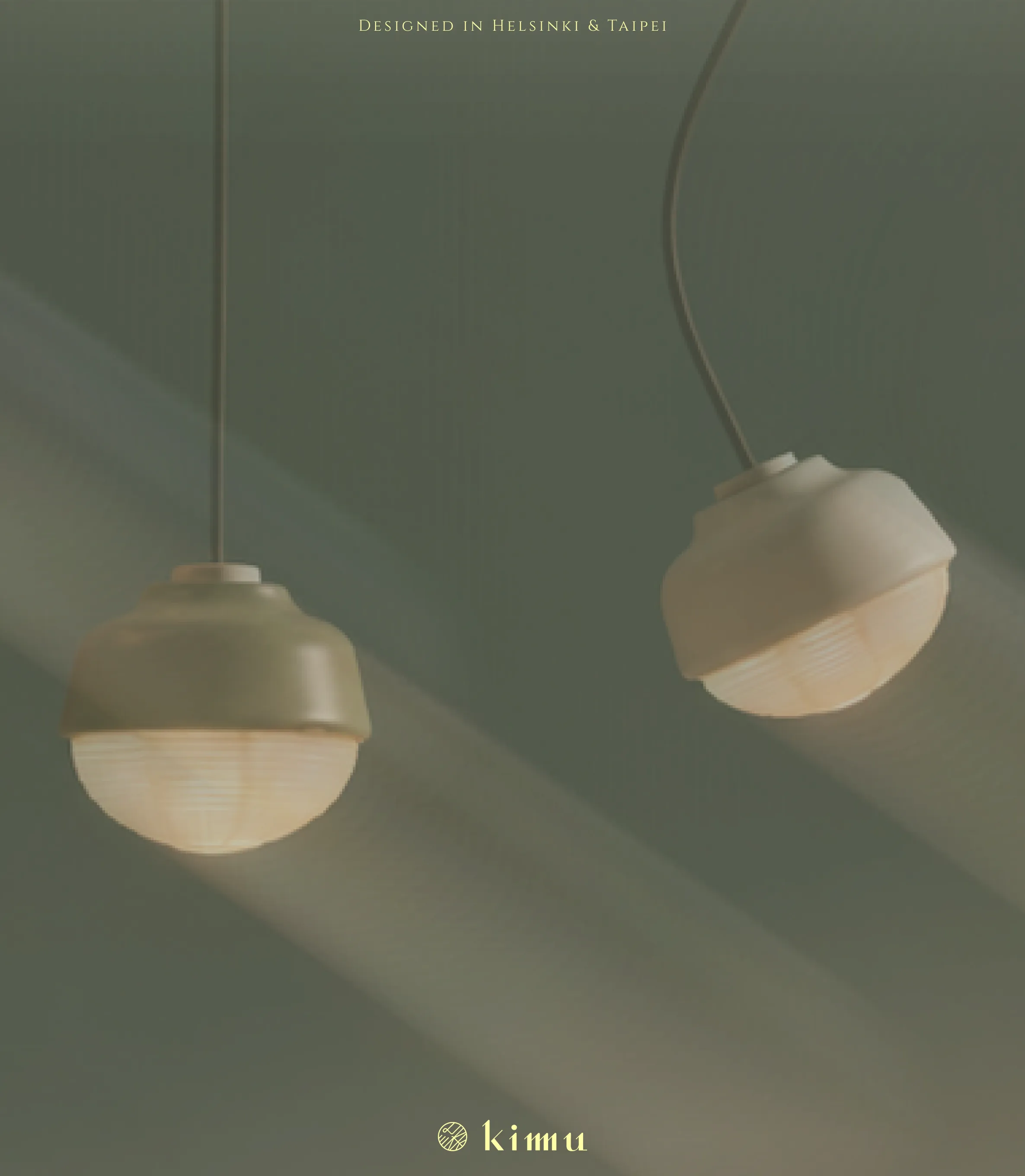
The identity was designed to feel restrained, adaptable and product-led.
Creating a consistent brand world without overpowering the objects themselves.
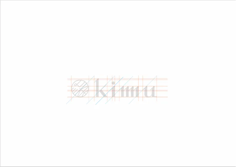
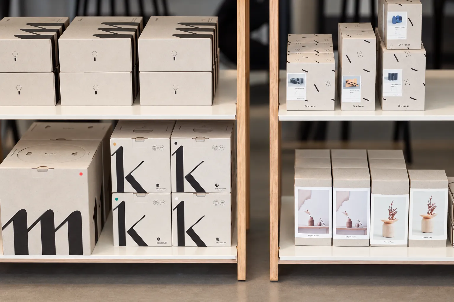
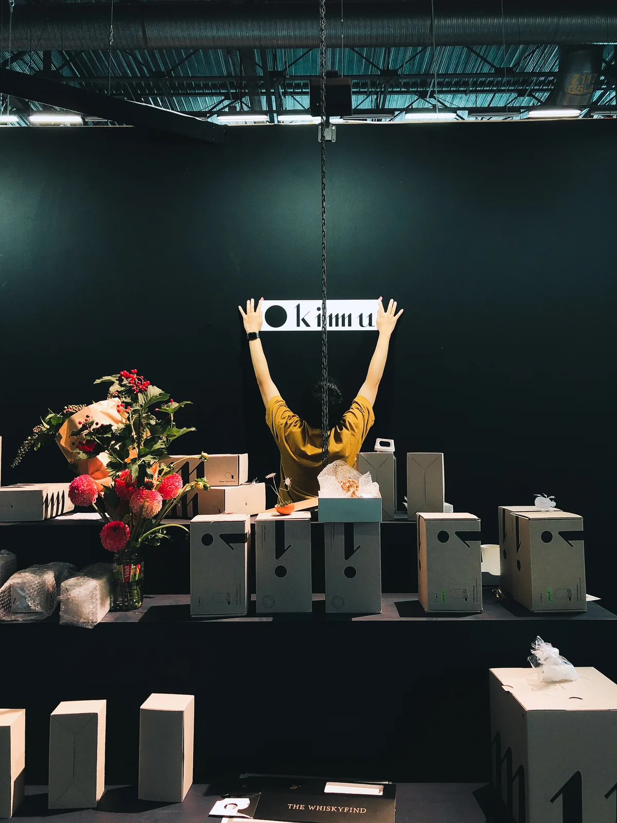
As a small independent brand, we couldn't rely on elaborate retail displays or exhibition builds.
So I made the packaging work harder: each box carries one part of the KIMU identity, and together they assemble into the full logo — turning packaging into a display system that could scale from a shop shelf to an exhibition wall.
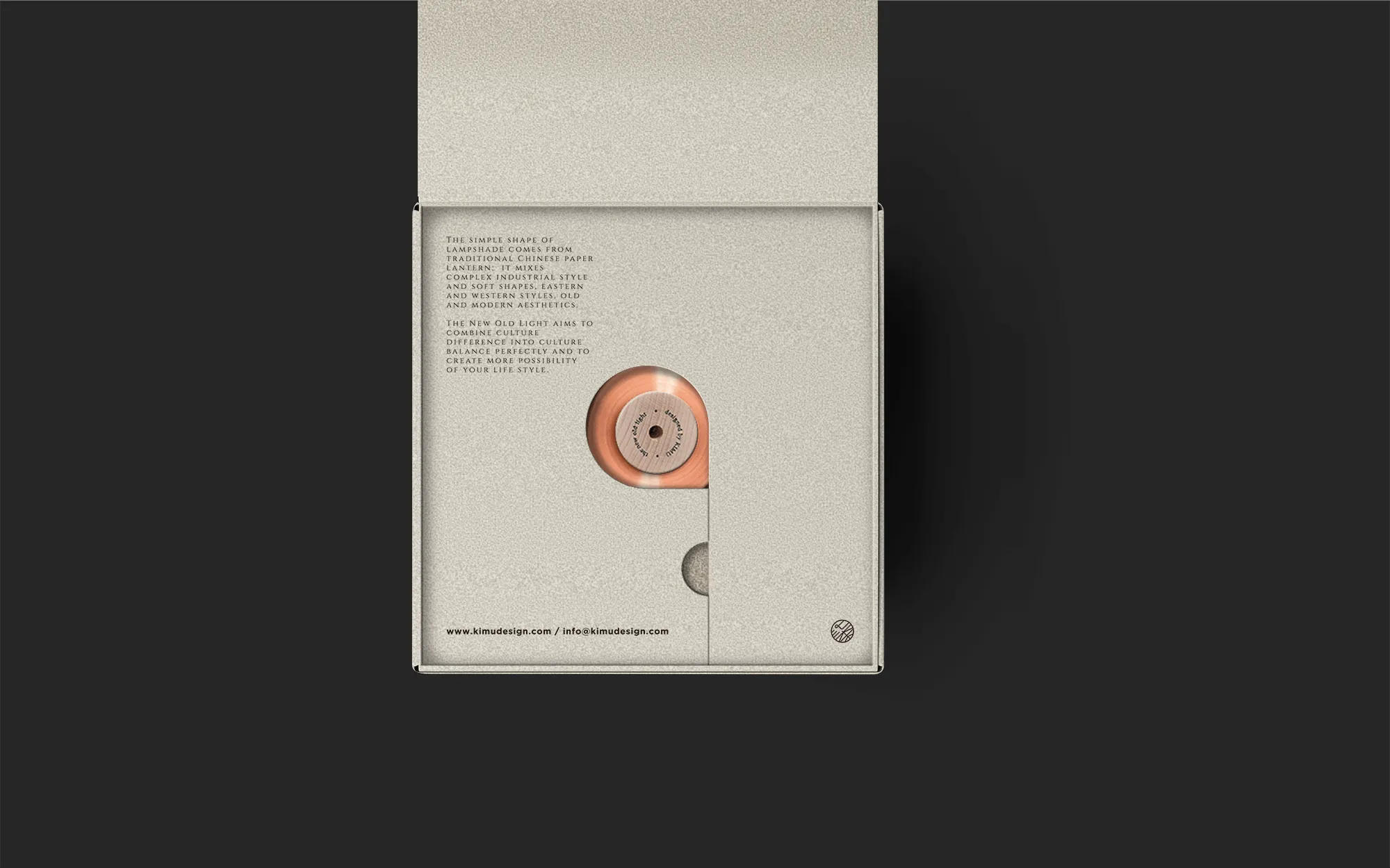
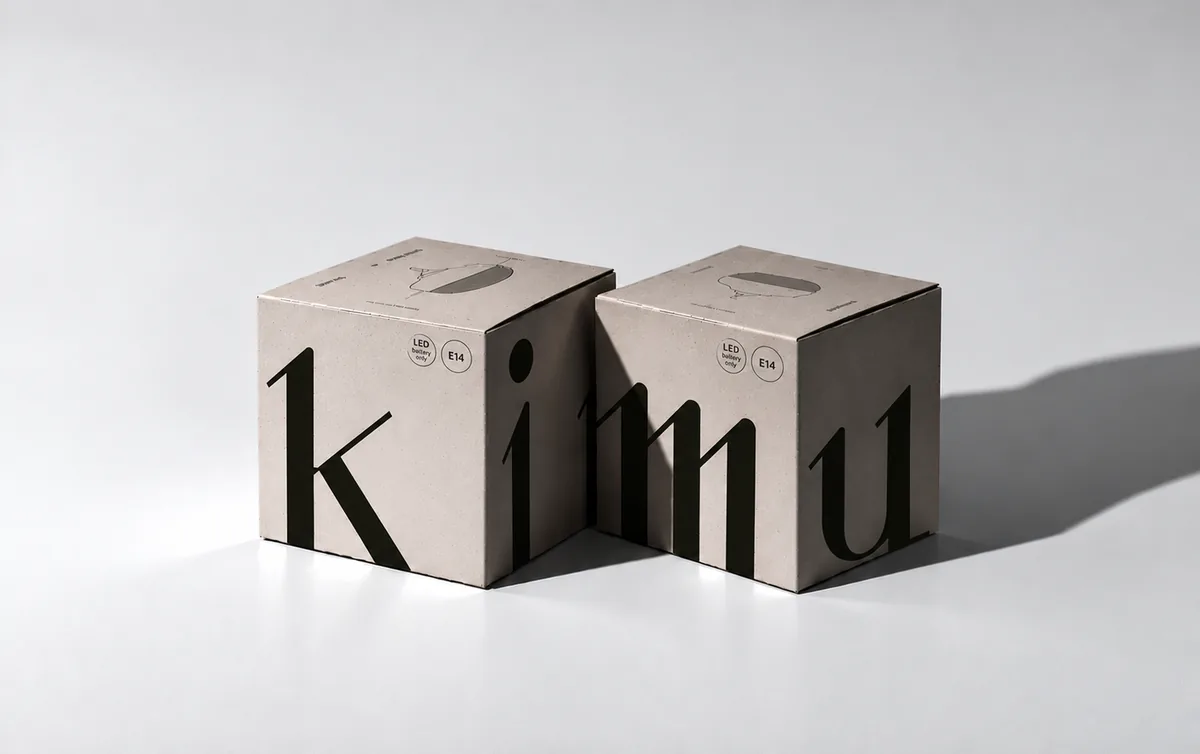
As KIMU reached a wider international audience, the website became more than a portfolio.
It needed to introduce unfamiliar objects, communicate the ideas behind them and support direct sales while staying simple enough for our small team to run ourselves.
Designed and developed by me
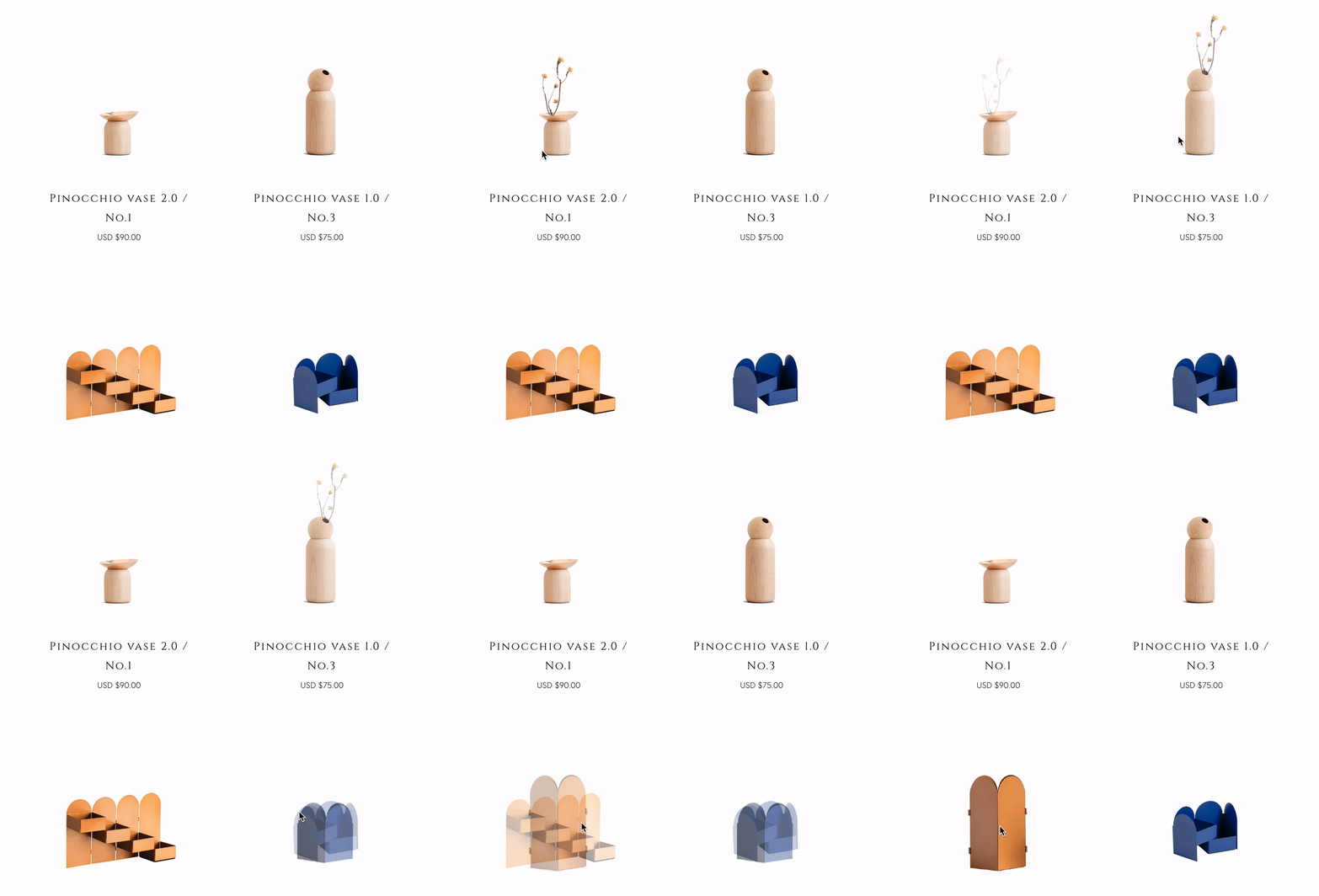
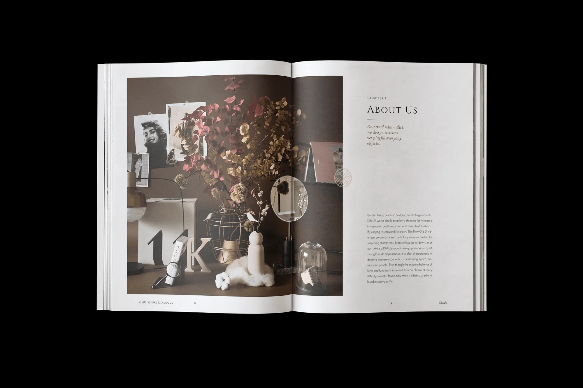
Minimal typography and restrained UI create a calm browsing experience.
Large imagery and quiet controls keep attention on the work.
Editorial layouts connect each product with the thinking and culture behind it.