challenge
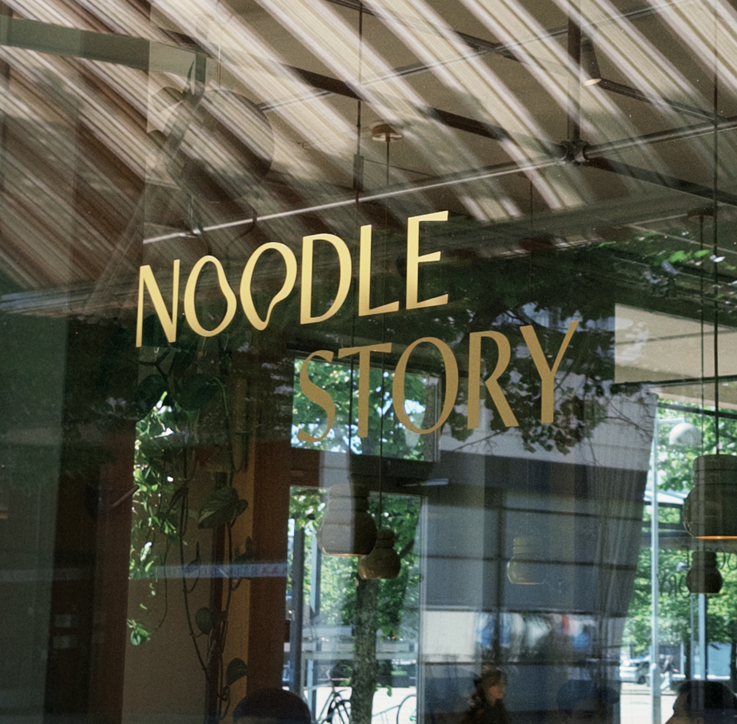
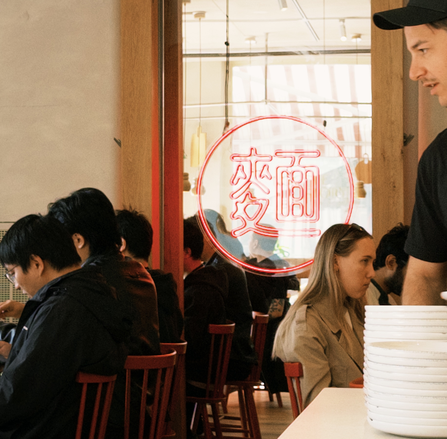
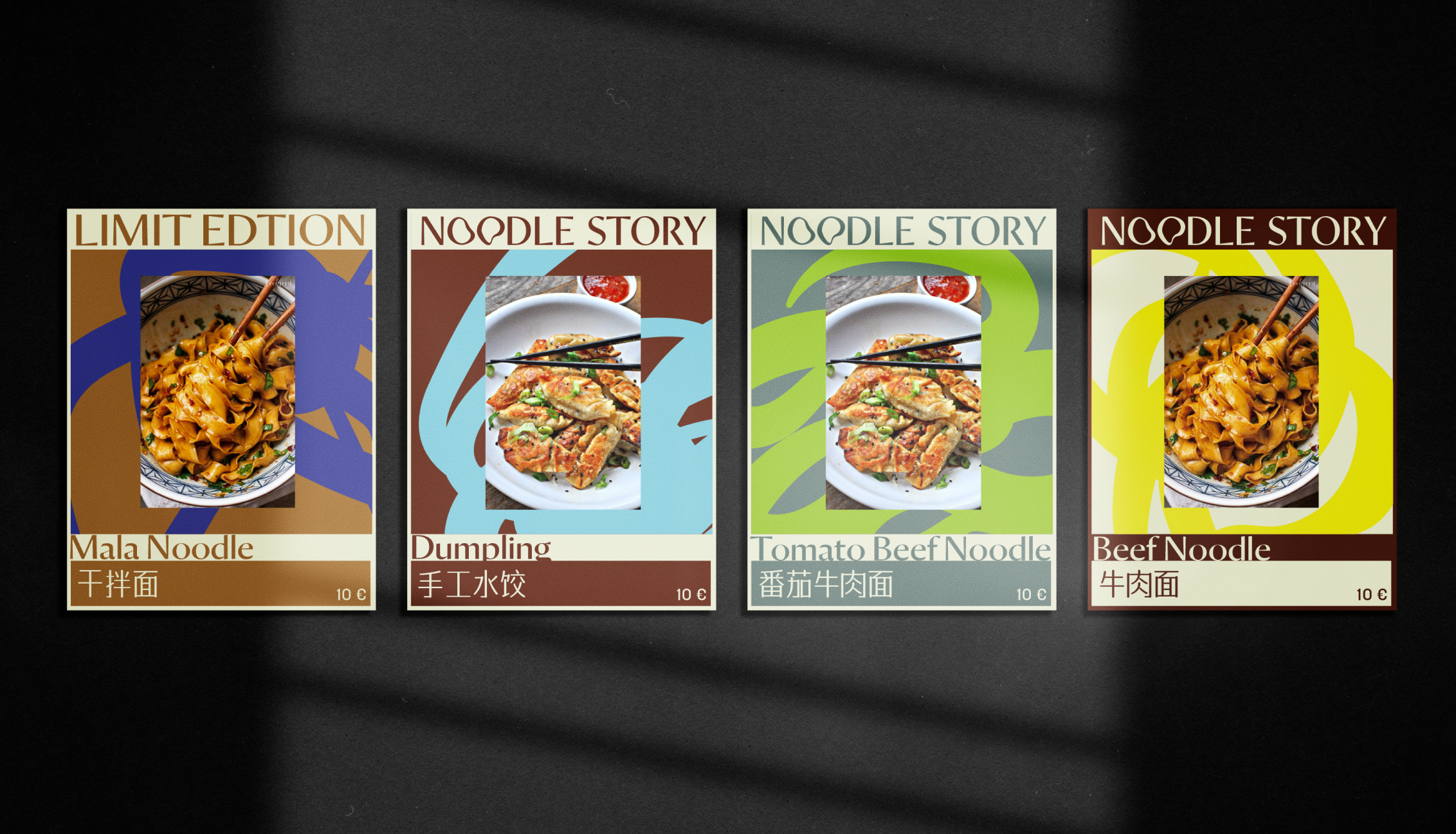
The challenge was to create a restaurant identity that celebrated handmade noodle culture while feeling contemporary in Helsinki’s design-conscious dining scene. Rather than relying on conventional visual references, I looked for a more abstract and expressive way to communicate the movement, tactility and flexibility of noodles.
Making it like noodle
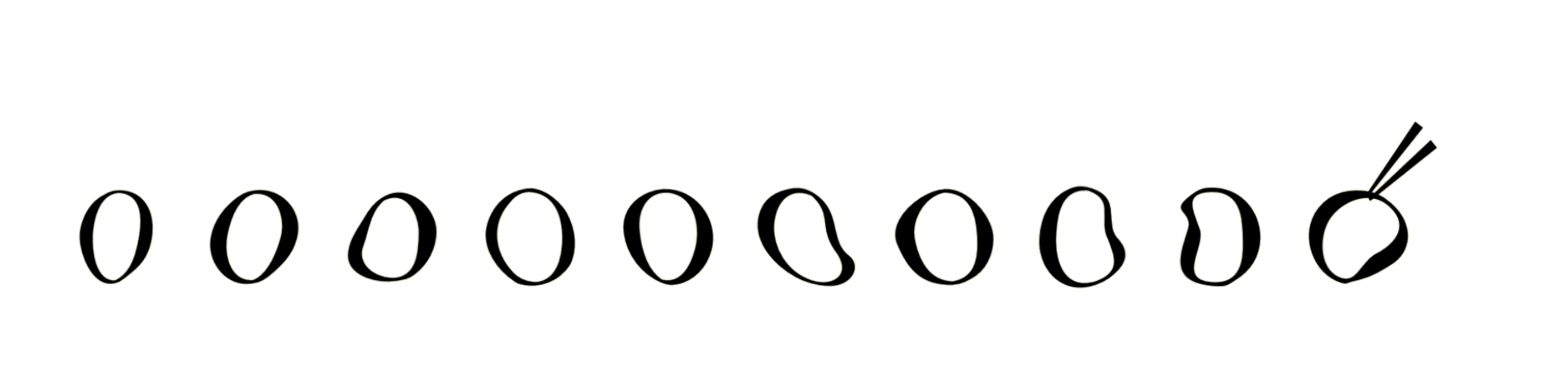
The identity began with one simple observation: noodles are endlessly flexible. They stretch, fold, twist and gather into different forms. I used this physical quality as the foundation of the brand.
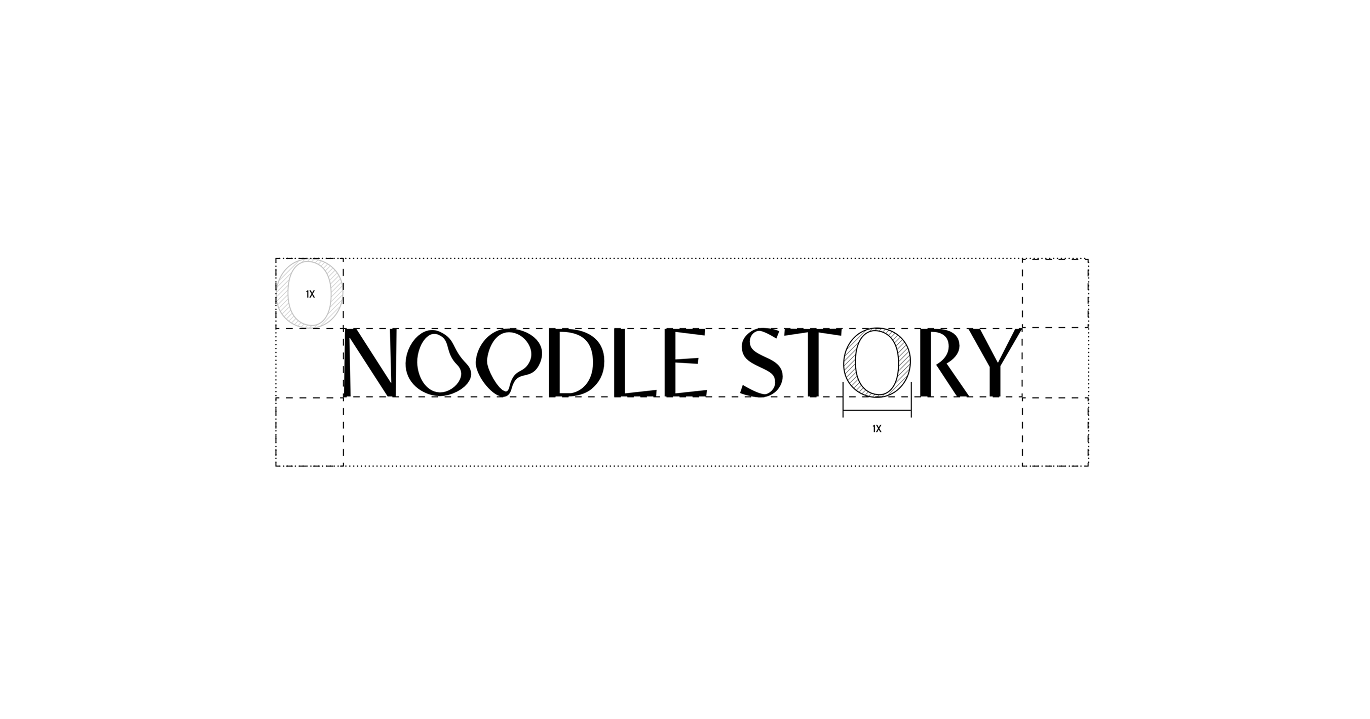
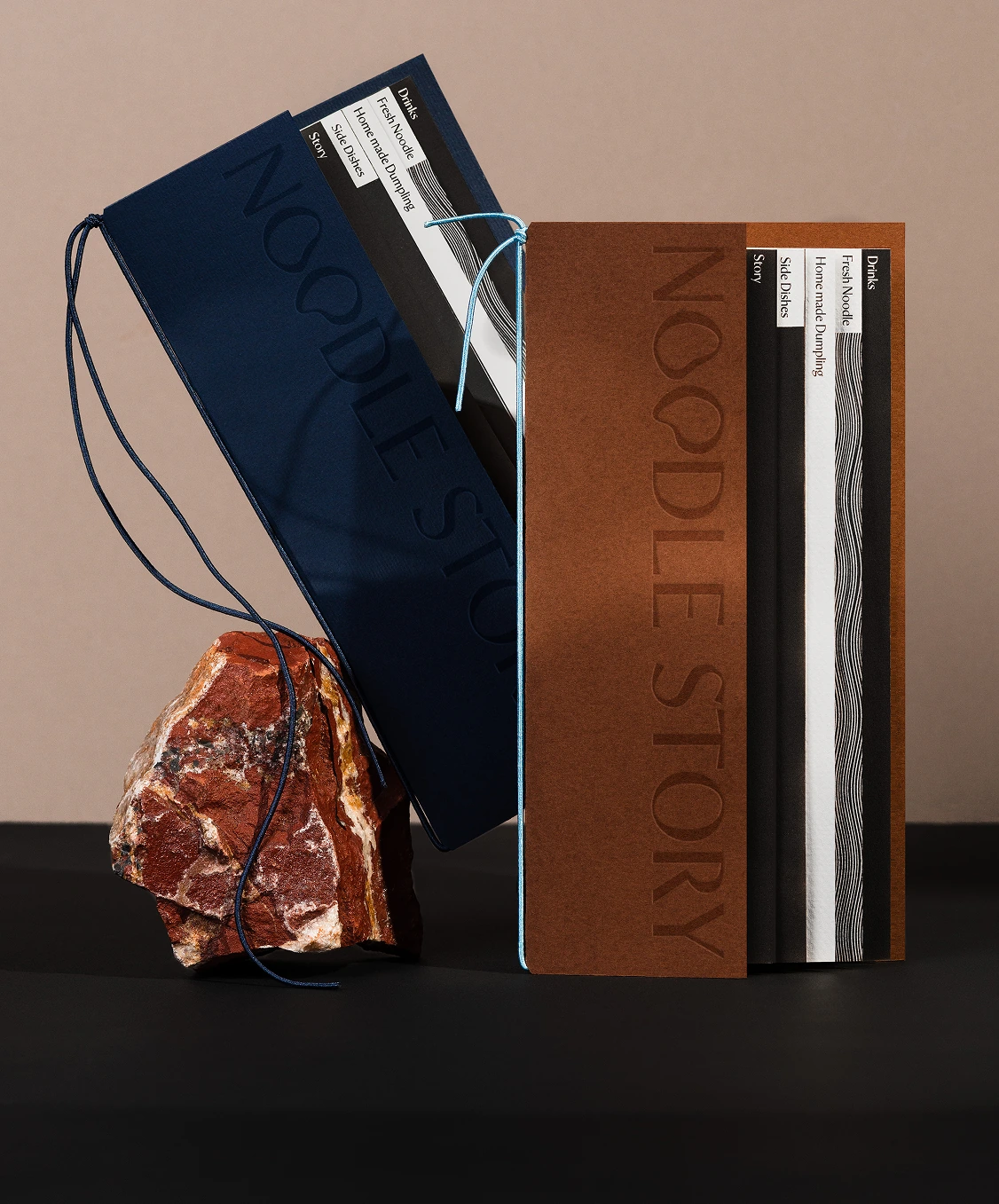
From the custom letterforms to the abstract brush shapes and flowing line illustrations, every element is designed to feel adaptable and in motion. The result is a visual system rather than a fixed graphic style—one that can change character while remaining recognisably Noodle Story.
A graphic language built from noodles
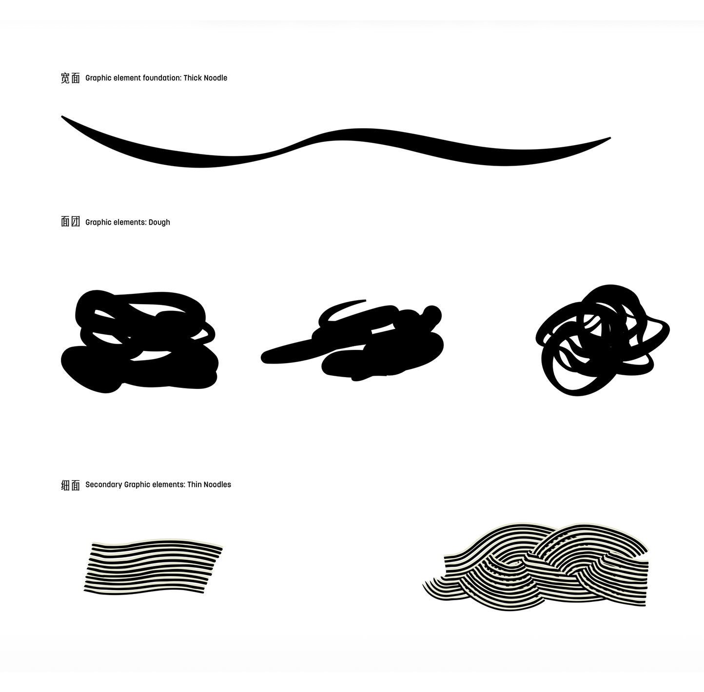
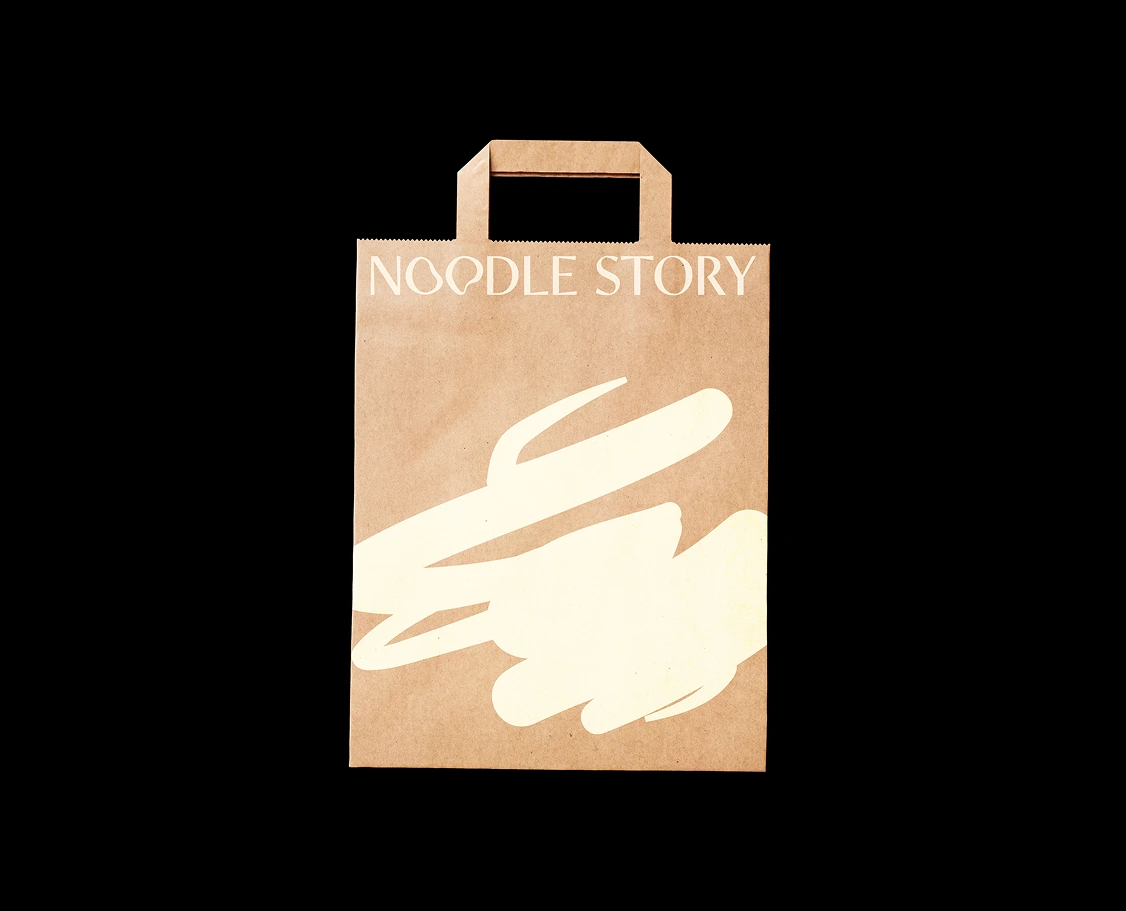
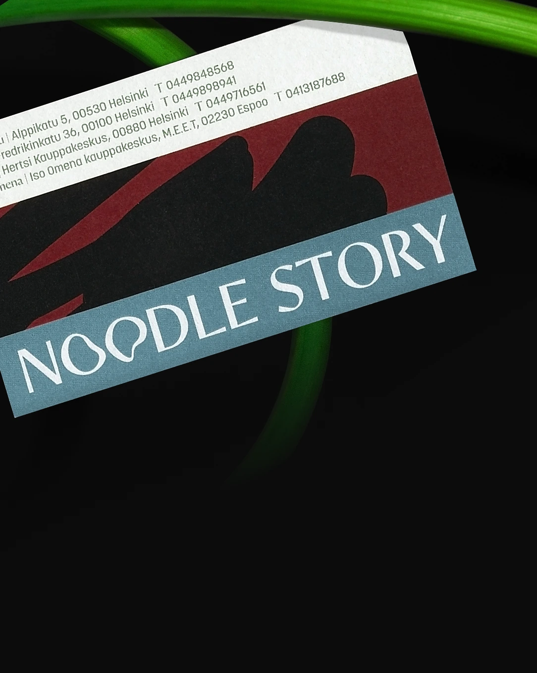
To extend the identity beyond the logo, I developed a graphic system based on two forms of noodles. A broad, hand-drawn stroke represents thick noodles and dough. It can expand, overlap and crop imagery, creating bold areas of colour and irregular framing devices.
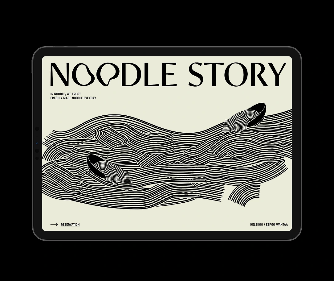
A second system of parallel lines represents thin noodles. These lines can be folded, layered and shaped into landscapes, waves and abstract compositions. Used together, the two elements give the brand both spontaneity and structure.
Typography
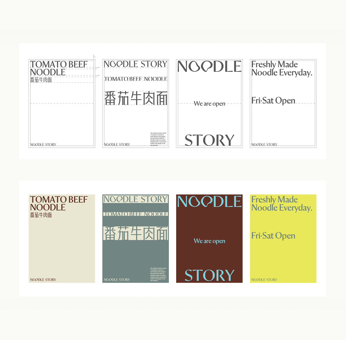
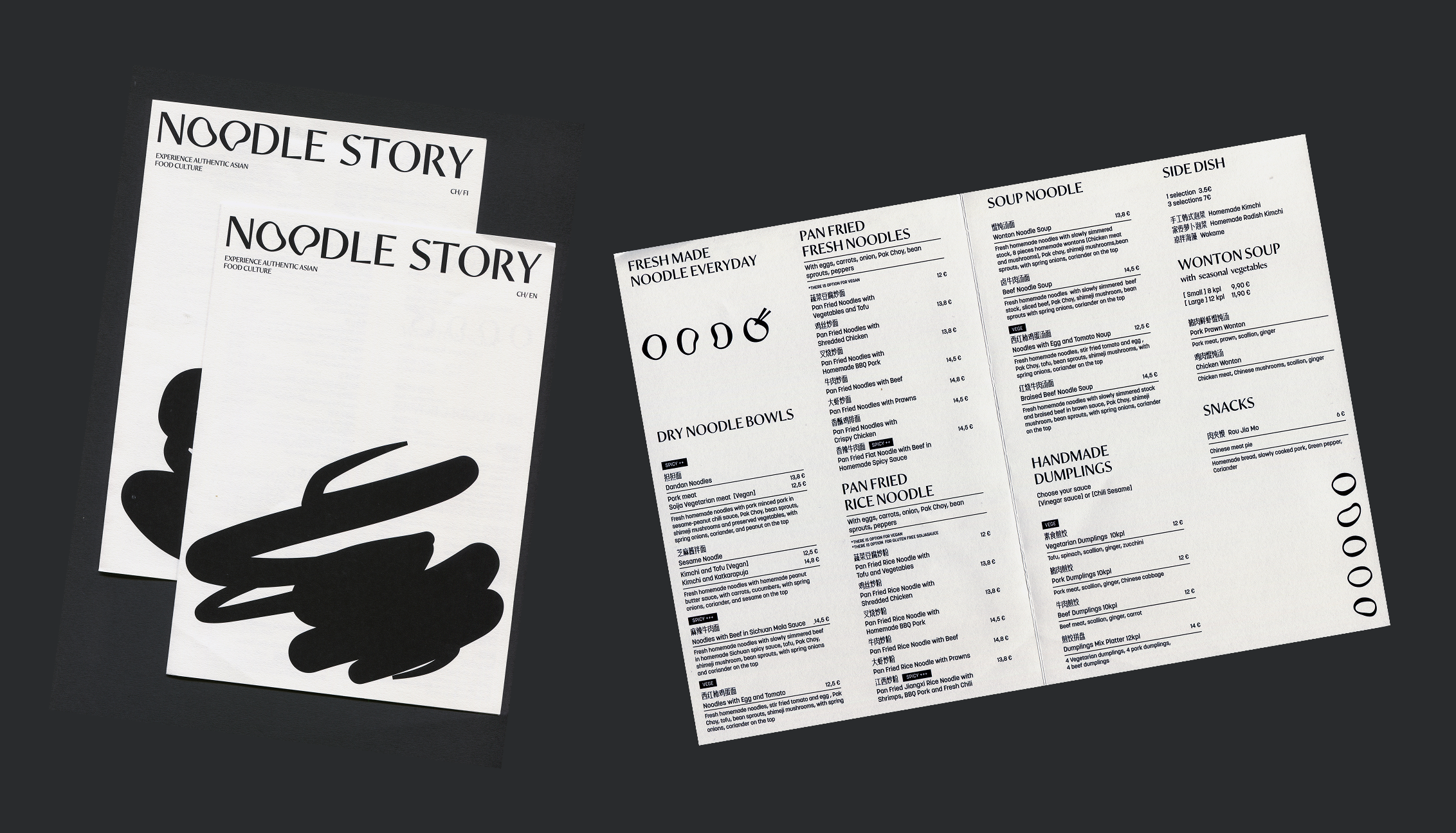
The typography combines an expressive serif with a more functional sans serif. The display type brings character and editorial sophistication, while the supporting typeface keeps menus, prices and practical information easy to scan.
Photography and art direction
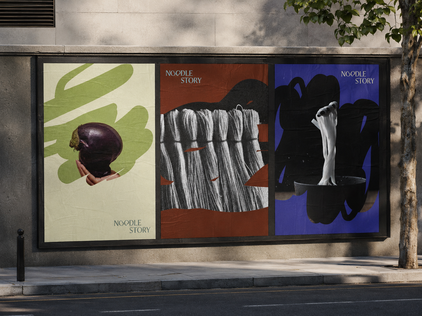
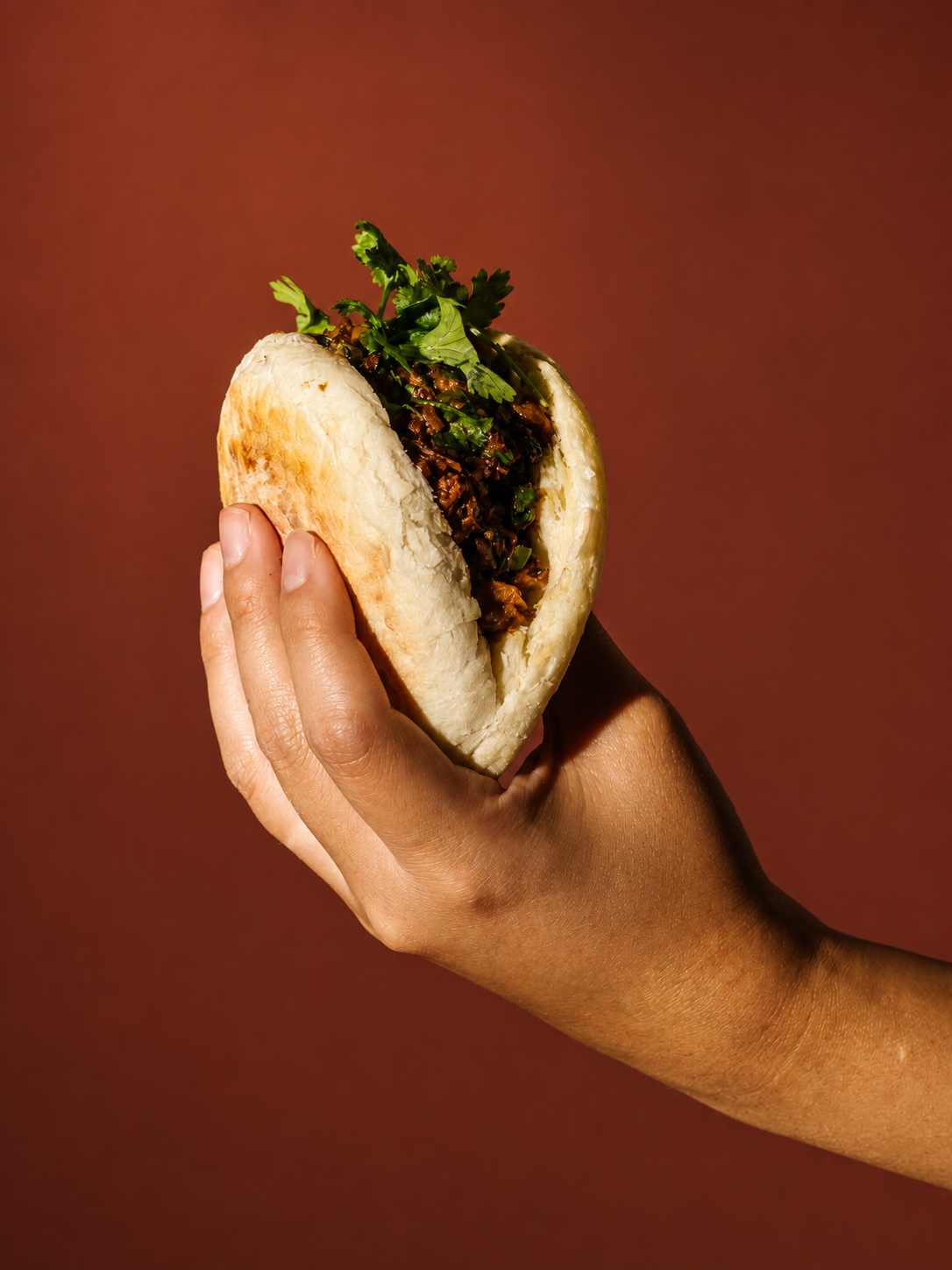
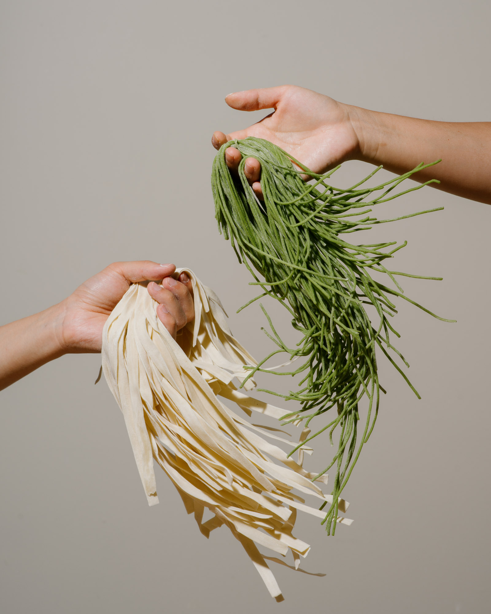
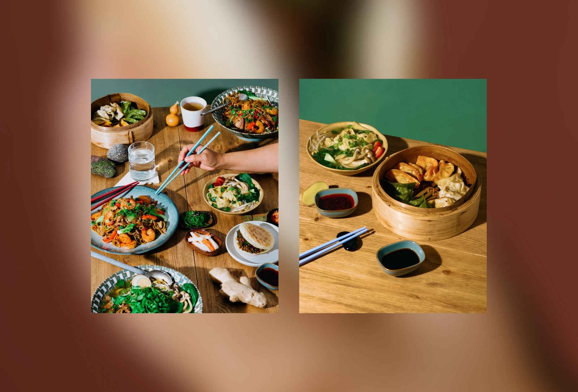
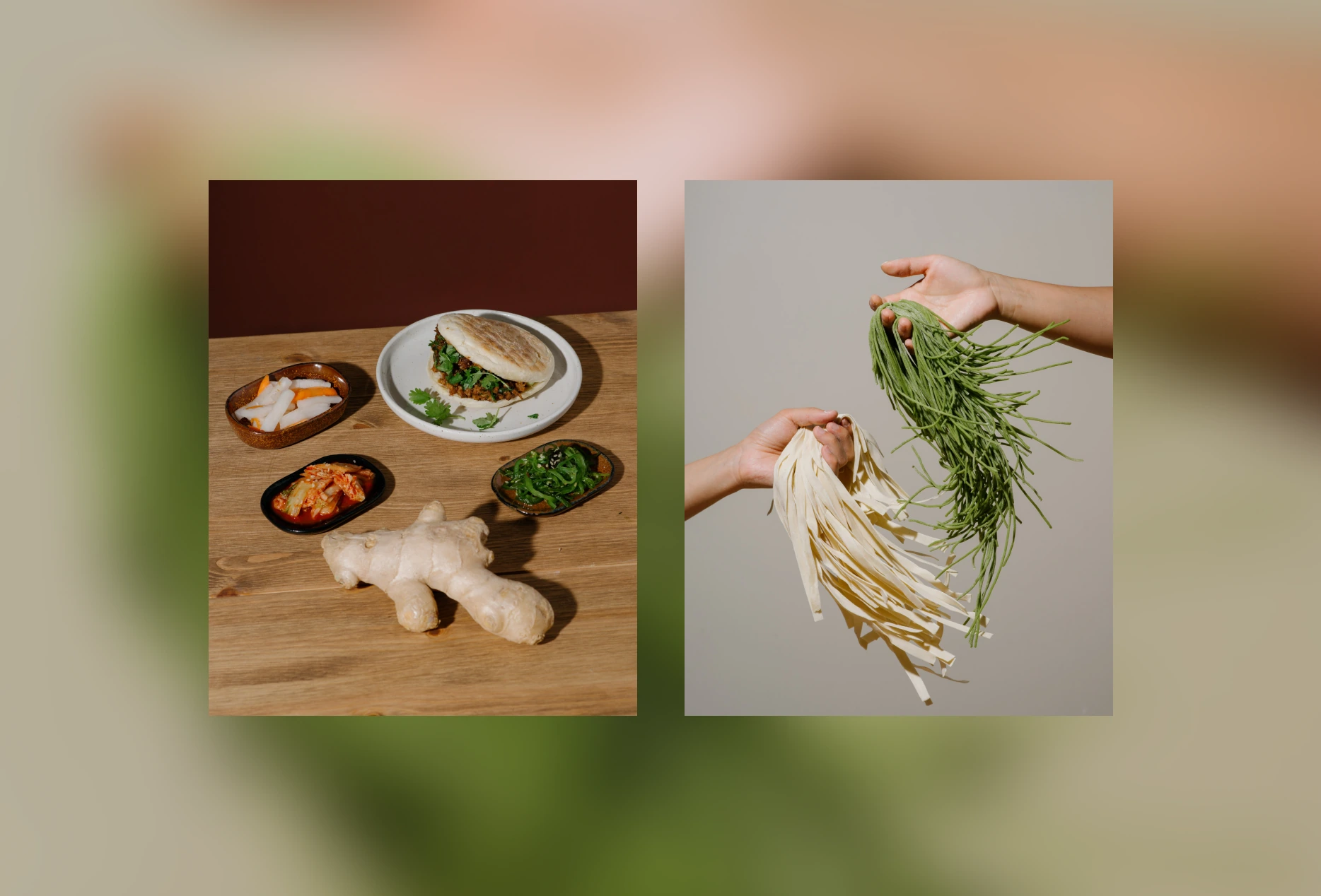
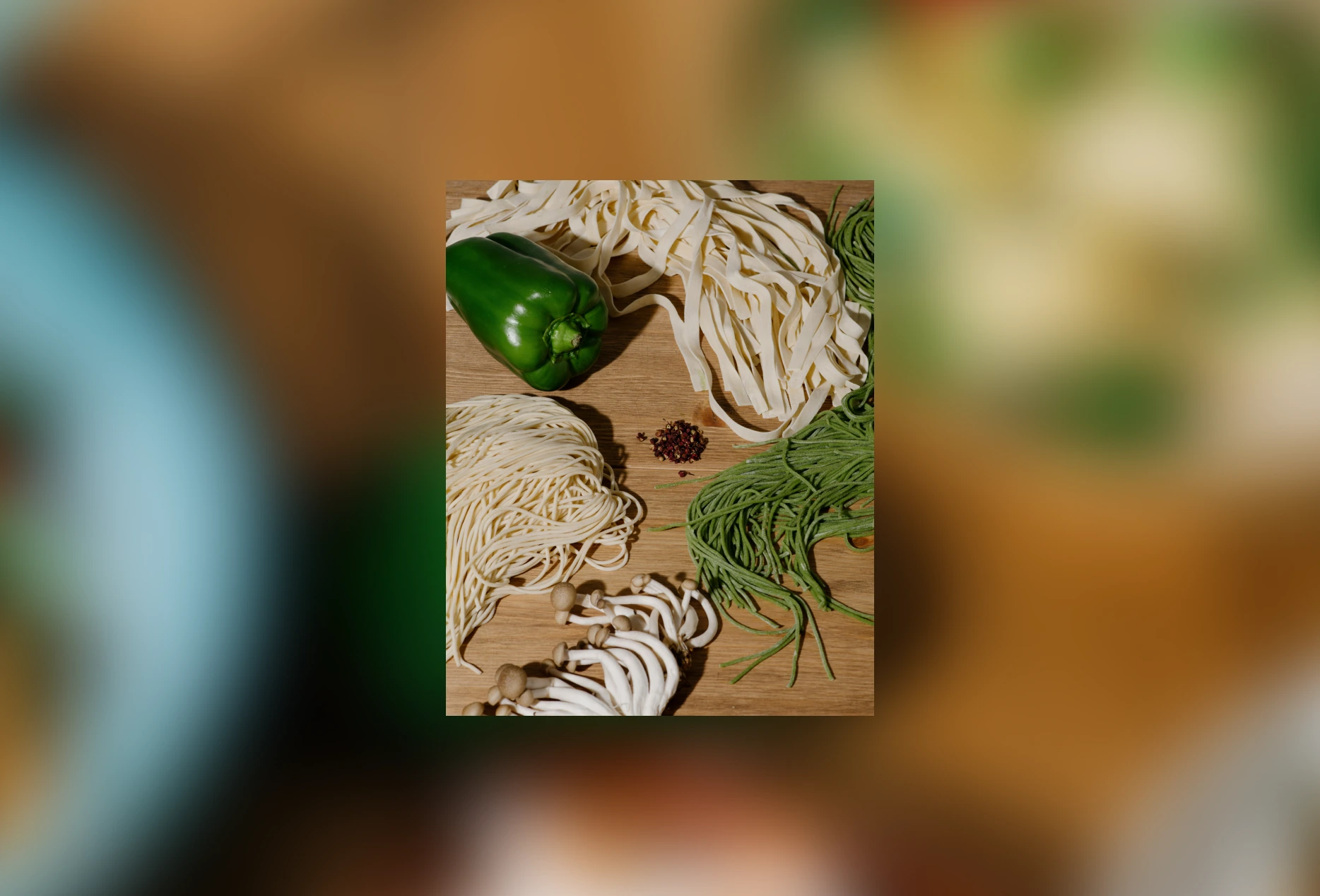
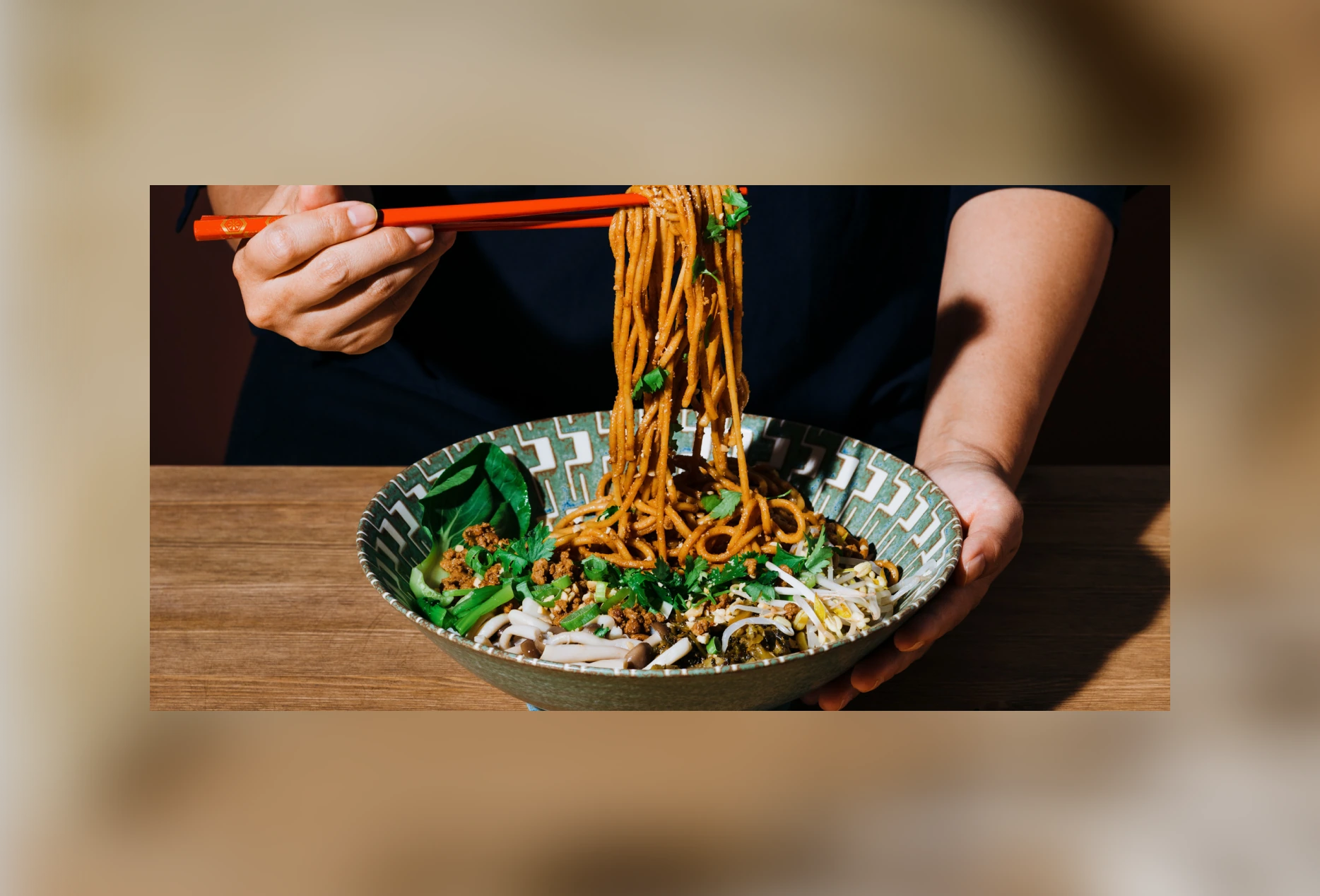
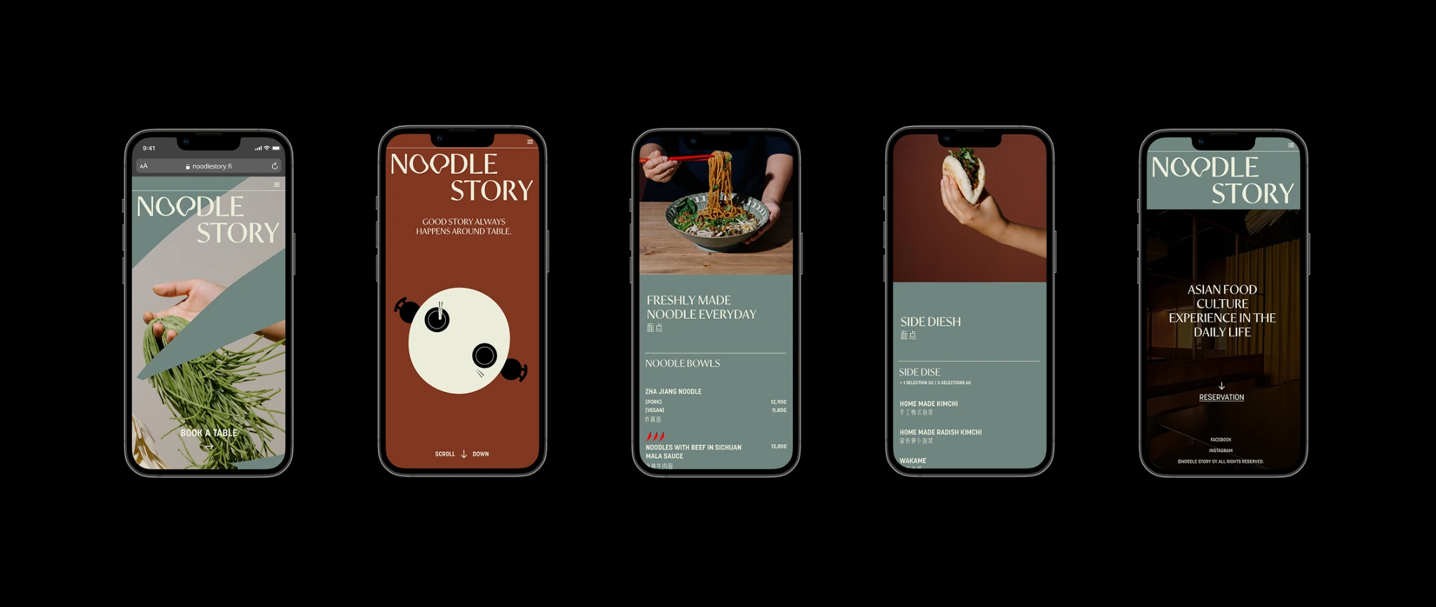
The art direction avoids conventional overhead food photography. Instead, food, ingredients and people are treated as sculptural subjects.Close crops, direct lighting and unexpected compositions bring a fashion-editorial attitude to the restaurant. Hands and ingredients appear frequently, reinforcing the handmade character of the food while keeping the imagery playful and slightly surreal.
Photographer Aava Eronen
Bringing the flexibility of noodles into the digital experience.
The Noodle Story website translates the brand's physical characteristics—stretching, folding and overlapping—into an interactive visual system.Instead of treating the noodle-inspired graphics as decoration, I used them as image masks, containers and structural elements throughout the interface. Oversized typography and editorial photography create an expressive first impression, while simple navigation keeps practical actions such as viewing the menu, finding locations and making a reservation immediately accessible.